Okay then, another year coming…!
As usual I started the year with some experiments. In this case, with a new medium, a glaze medium to be precise. Being a big fan of Van Eyck, glazing layers - not the same as varnish - enhance the color depths substantially. I mixed each color at forehand and then painted on a piece of unstretched canvas. I know it's a simple image, could be a window or something, but the subject wasn't important, yet. What was important thought was that it felt very much like a substantial step in my oeuvre.
It's important to realize that using a glaze medium had nothing to do with varnish, although the resultant can look a bit the same, at least superficially. (Compare it with the stucco of a house (Belgium) coated with a color - witch looks flat and death, and when the stucco was mixed with color pigment (Italy) - witch has a deep look.) Using a glaze medium does not dilute the paint but makes it more liquid and at the same time more intense.
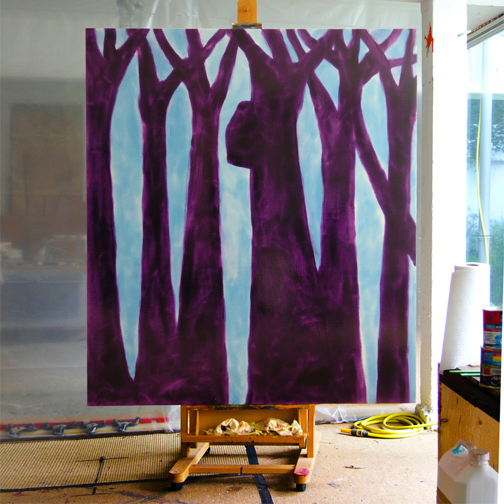
Not every work does survive this new approach to painting though. As a matter of fact, most of them won't make it past summer. This glaze technique could only be developed painting by painting. It wasn't a theory. "Chapel Of Ease" (oil & glaze medium on canvas, 200 x 240 cm).
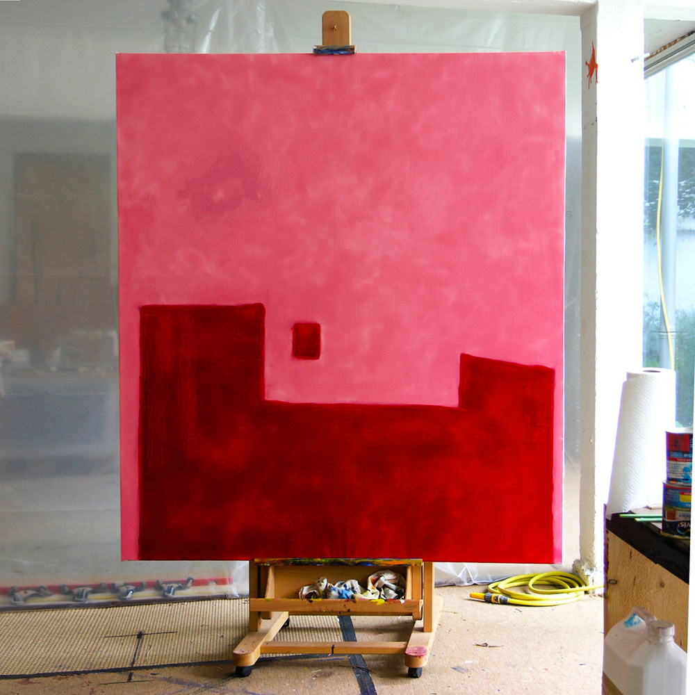
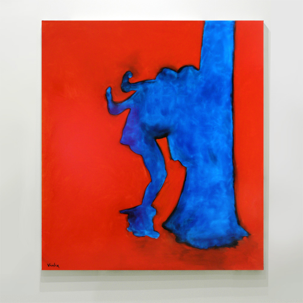
The first painting that came out of that new technique (and survived) was "Lost Child" (oil & glaze medium on canvas, 160 x 180 cm). The subject of empty beds was a recurring theme in my work, just as were trees, plants, nudes, wolves, silhouettes and single color surfaces.
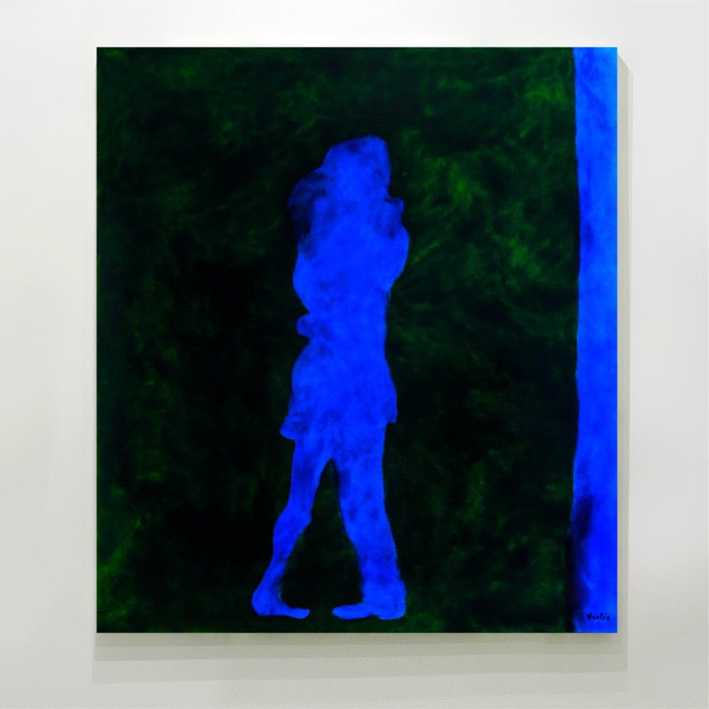
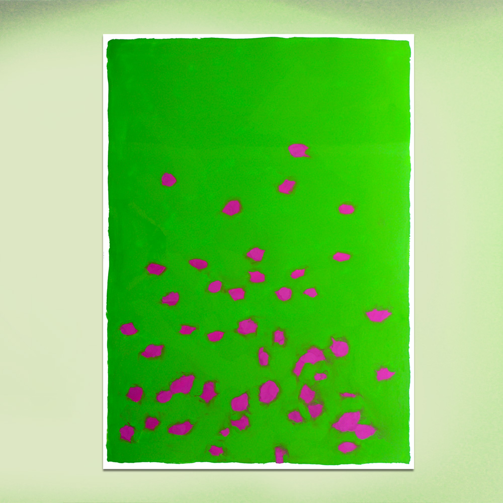
After some weeks of experimenting with this new way of making paintings (and repainting), I picked up a subject again that I used for the painting series “Tokyo Park” (2012), based on the photo book “The Park" by Kohei Yoshiyuki. “The Lie” (oil & glaze medium on canvas, 160 x 180 cm)
Not only did inspired the photo book "The Park" me, the whole Japanese way of working, past and present, did that. I noticed that the Japanese influence in my work became more evident of the years. “Tokyo Park” (oil & glaze medium on canvas, 160 x 180 cm)
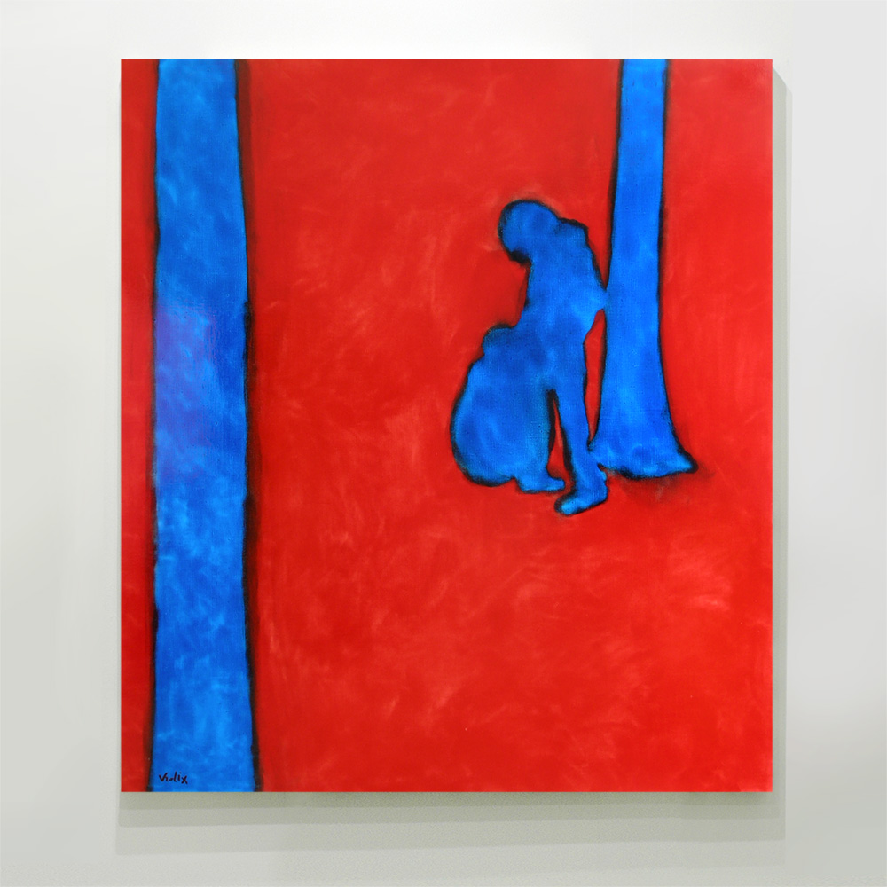
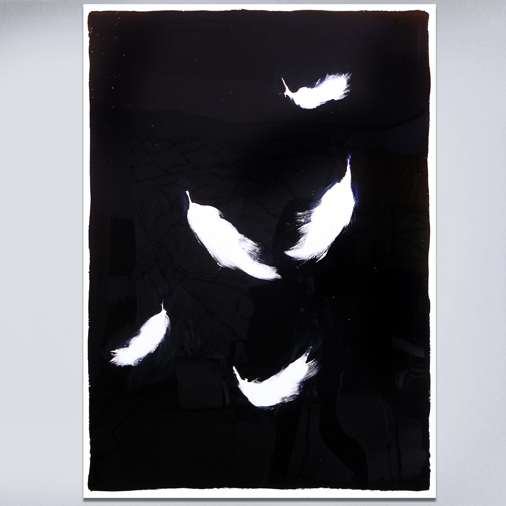
The subject in these works, by the way, wasn't erotic or sexual, it was social. “Wildlife” (oil & glaze medium on canvas, 160 x 180 cm)
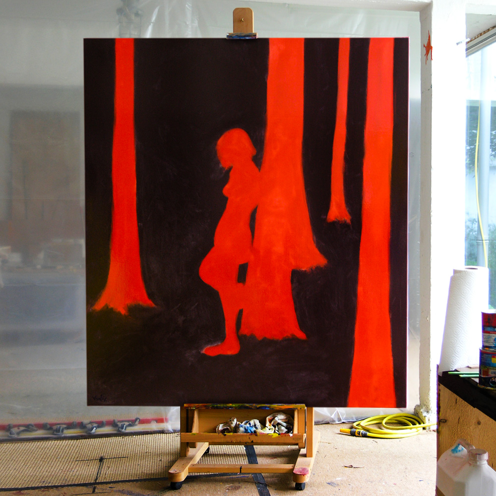
Little Red Riding Hood (oil & glaze medium on canvas, 160 x 180 cm) was the final painting in these series.
Exceptionally I made a new series of Sumi (enamel on pvc, 100 x 140 cm), works that were based on the traditional Japanese Sumi-é and the Rinpa School. All were inspired by a Haiku. “Floating from the west Blossoms gather In the east.”
Sumi (enamel on pvc, 100 x 140 cm) “Behind trees I saw the sun arise Day of spring.”
Sumi (enamel on pvc, 100 x 140 cm) “I walk And walk some more Poppies bloom.”
Sumi (enamel on pvc, 100 x 140 cm) “Life, Can be so short. Like the night is brief.” Someone asked me if I wrote the Haikus myself. Yes, I did.
One of the last animation videos I did was "The Raven" a poem by Edgar Allan Poe. This video came about by accident, while reading some of Poe's work, when I suddenly saw the view from my window, a full moon behind the leafless trees. The raven I drew in to it later, it seemed appropriate considering what I had been reading. The voice-over, albeit somewhat deformed, was from Christopher Lee. I wasn't a Gothic person or even a romantic one but this was a moment worth capturing, I thought.
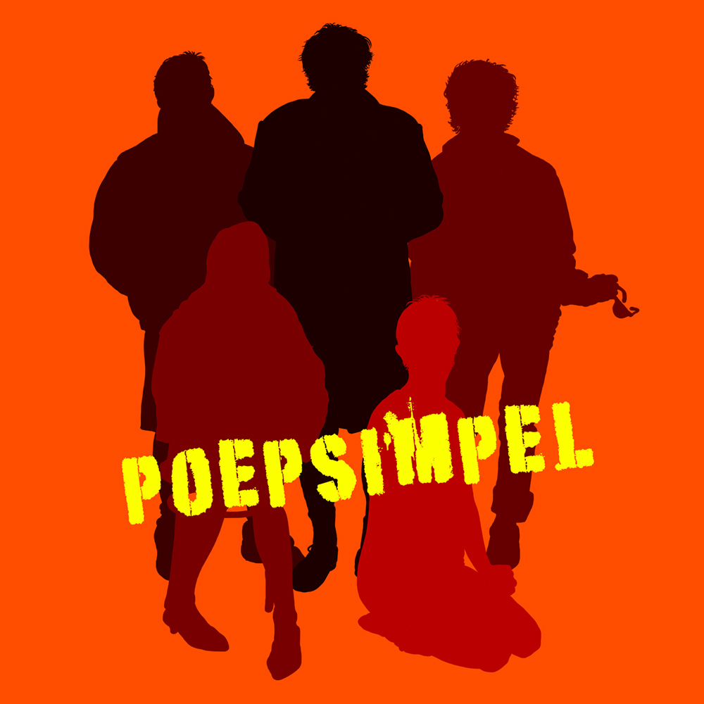
The play "Poepsimpel" (Easy Peasy) was a kind of family play, hence the family portrait design for the poster.
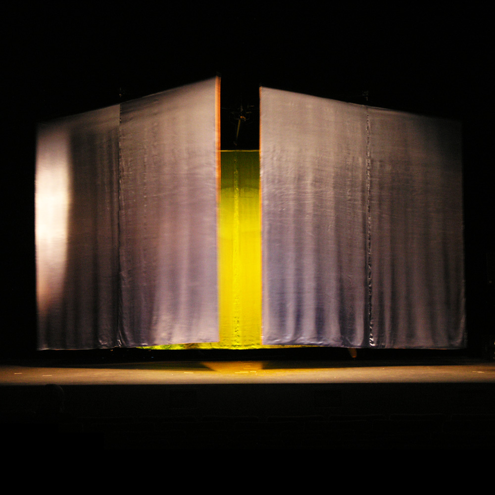
The play "Poepsimpel" (Easy Peasy) was a bit of a challenge. The director wanted a kind of set that could be switched at any time, like in a movie, but on stage and live. Easier said than done. That was to say, until I came up with the idea of course.
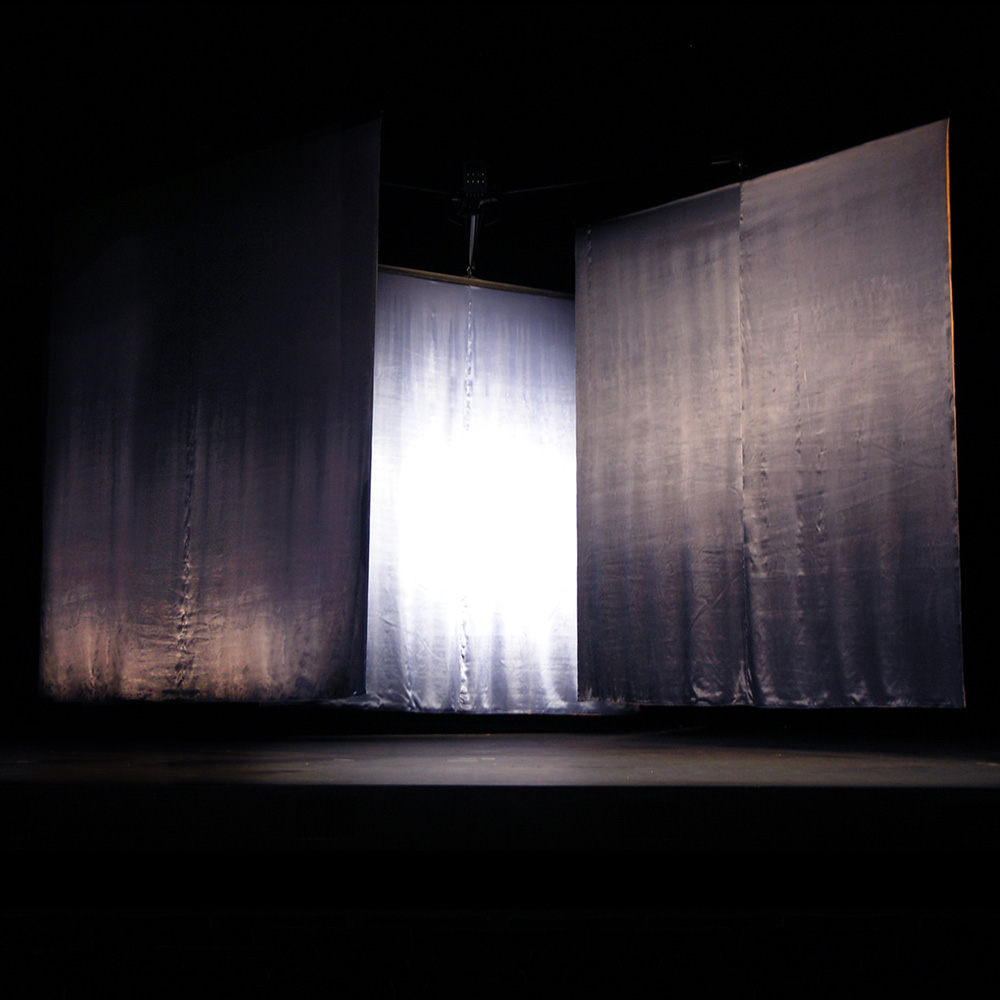
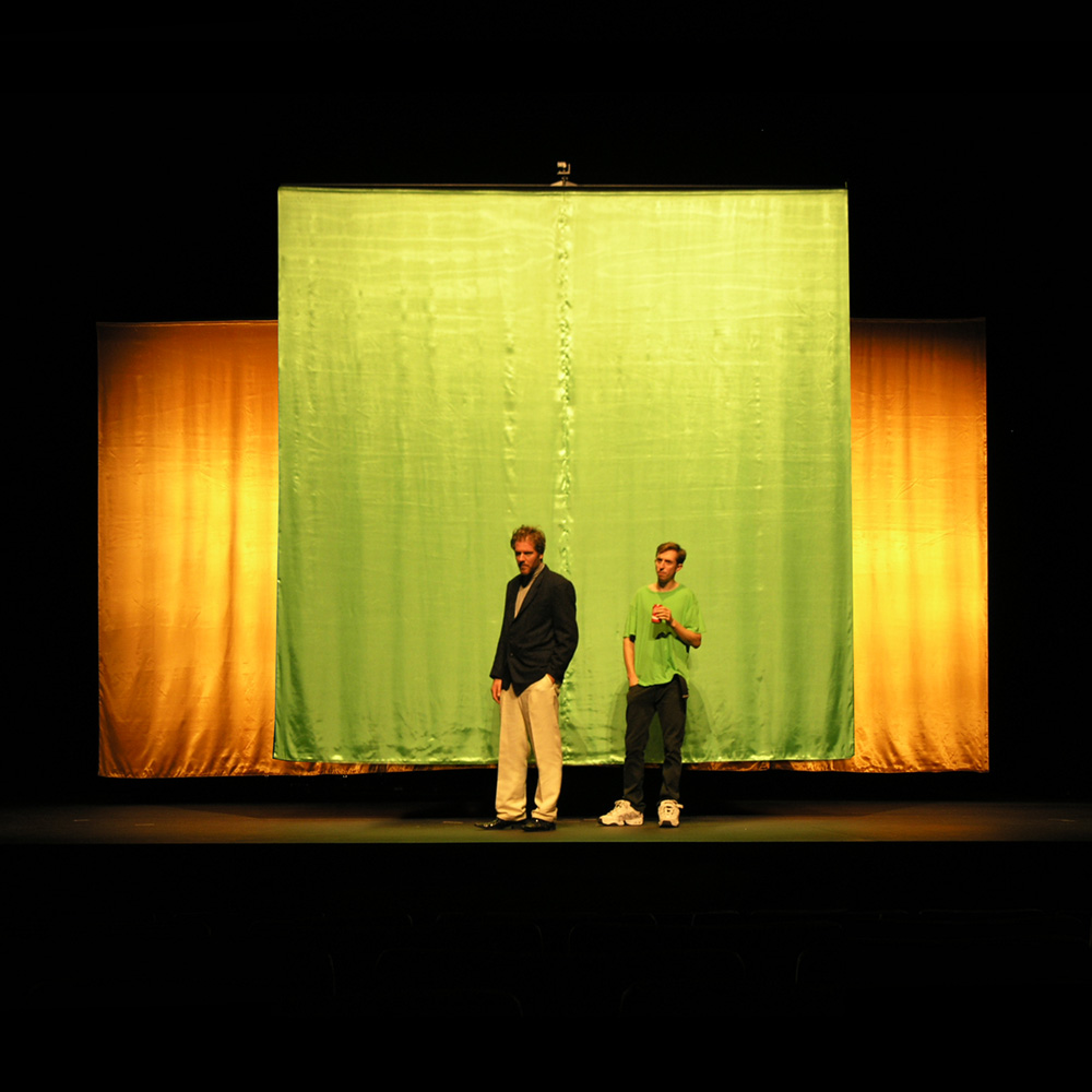
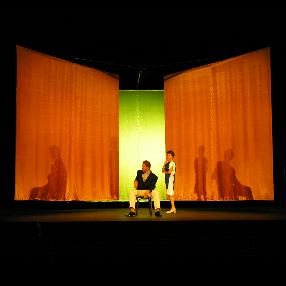
To start with, the set for "Poepsimpel" was made from colored silk walls that rotates on its own axis as well as one big axle in the middle, thus creating actual spaces and landscapes, depending of the color and the actors various roles. Set Up: Midnight in the city.
Set Up: In the garden.
Set Up: Inside the grand room. O yes, it's important to mention that the actors played different characters, male as well as female.
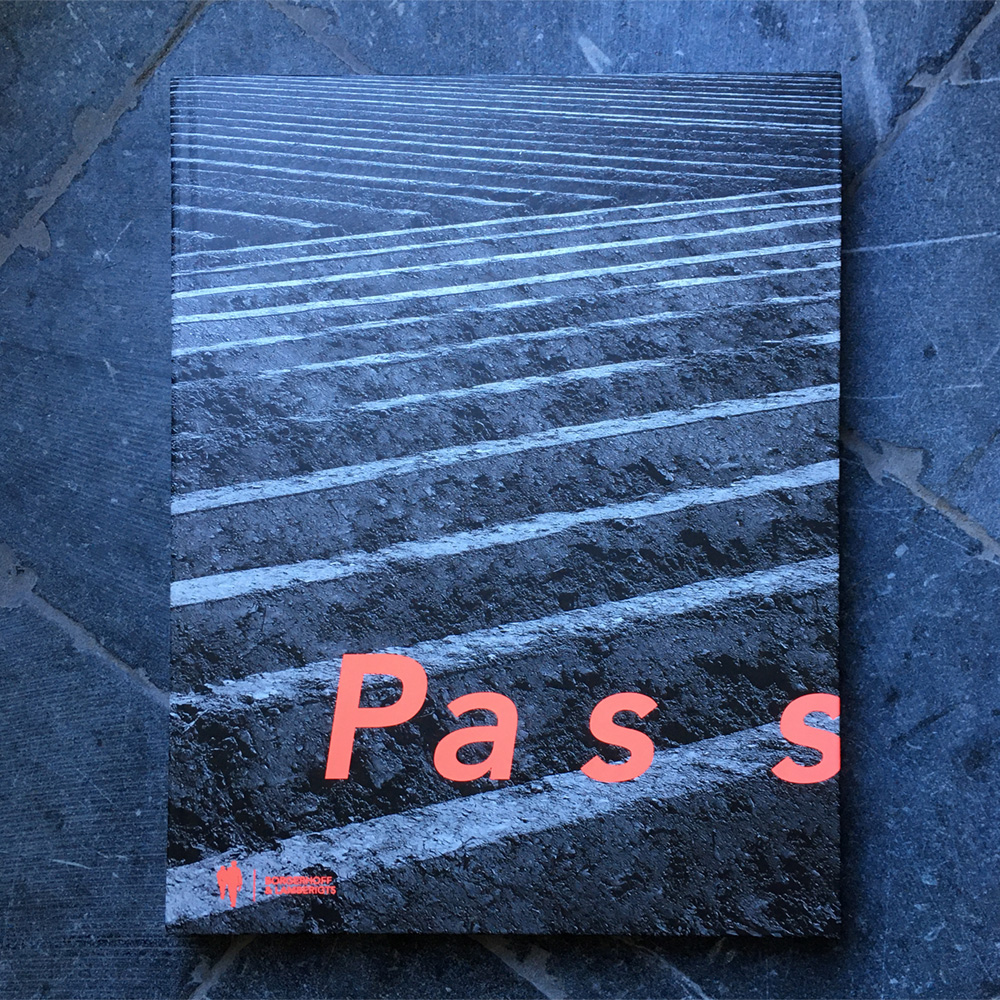
That year I also got invited to participate in a group show called PASS. PASS was a sort of art-trail along the little villages Mullem, Huise and Wannegem-Lede near Ghent, curated by Jan Hoet Jr. and initiated by the artist Kris Martin. The catalogue for PASS.
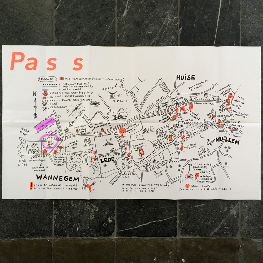
The map to the art-trail PASS.
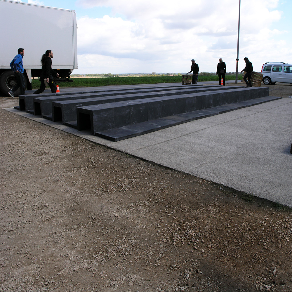
Installing the piece at PASS took some time because it was completely constructed out of black concrete blocks.
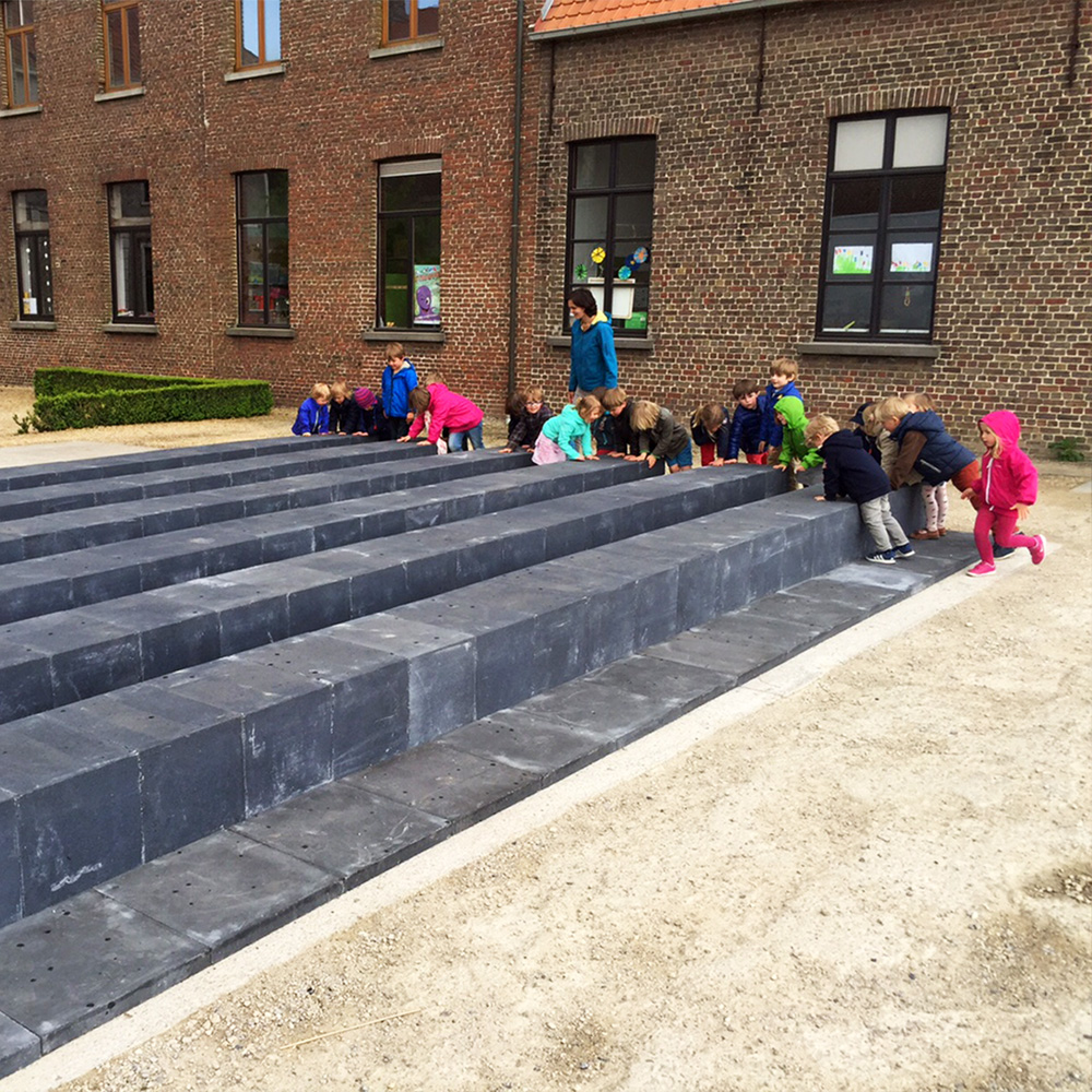
First visitors (from the preschool right next to the site).
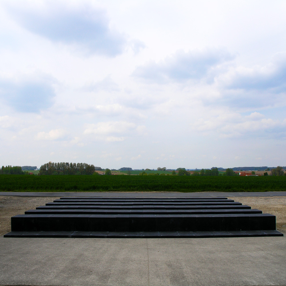
Opening weekend of PASS. The installation was called "Lacrima" of course, because I used it first for the same play by Arne Sierens. It was even performed a couple of times during the exhibition.
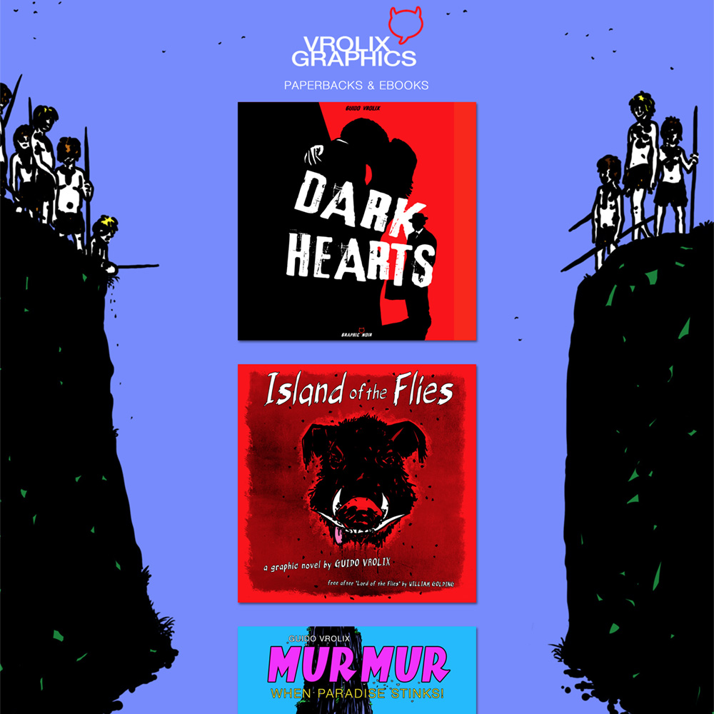
Vrolix Graphics Publisher. Because I started to create graphic novels more often now, I decided to start up a publishing company. Easier said than done, of course. Then I found out, it wasn't. The possibilities for (self)publishing and print-on-demand were growing by the day, as was their quality. I discovered the American firm CreateSpace were you could publish your books as paperback as well as ebook. They were acquired by Amazon later, which had the huge benefit of not having to pay an extra fee for distributing books via the world’s largest online bookstore. Another important thing was that the actual printing of the book was done in the country where it had been ordered. If you wanna take a peek:
GRAPHIC NOVELS & Co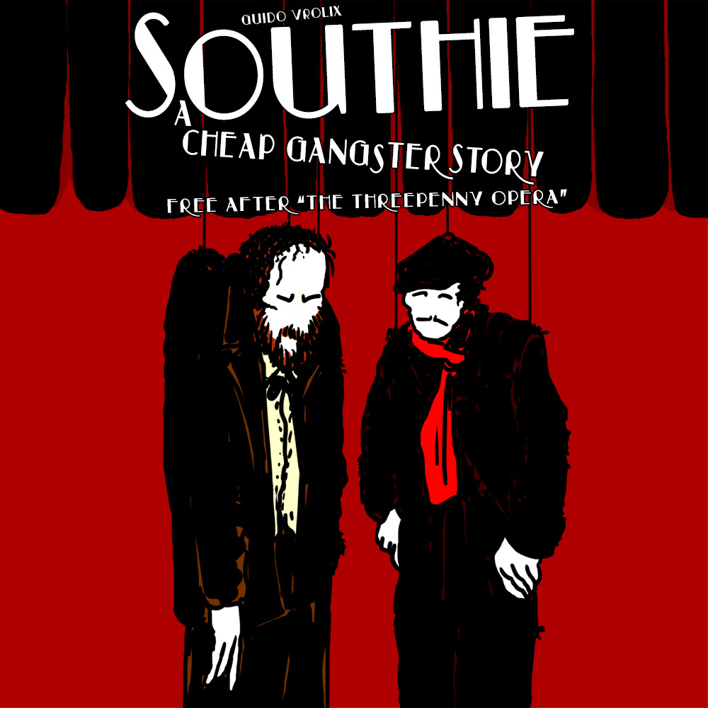
One of the graphic novels I did that year was: “Southie - A cheap gangster story.” It was based upon “The Threepenny Opera” by Bertolt Brecht.
GRAPHIC NOVELS & Co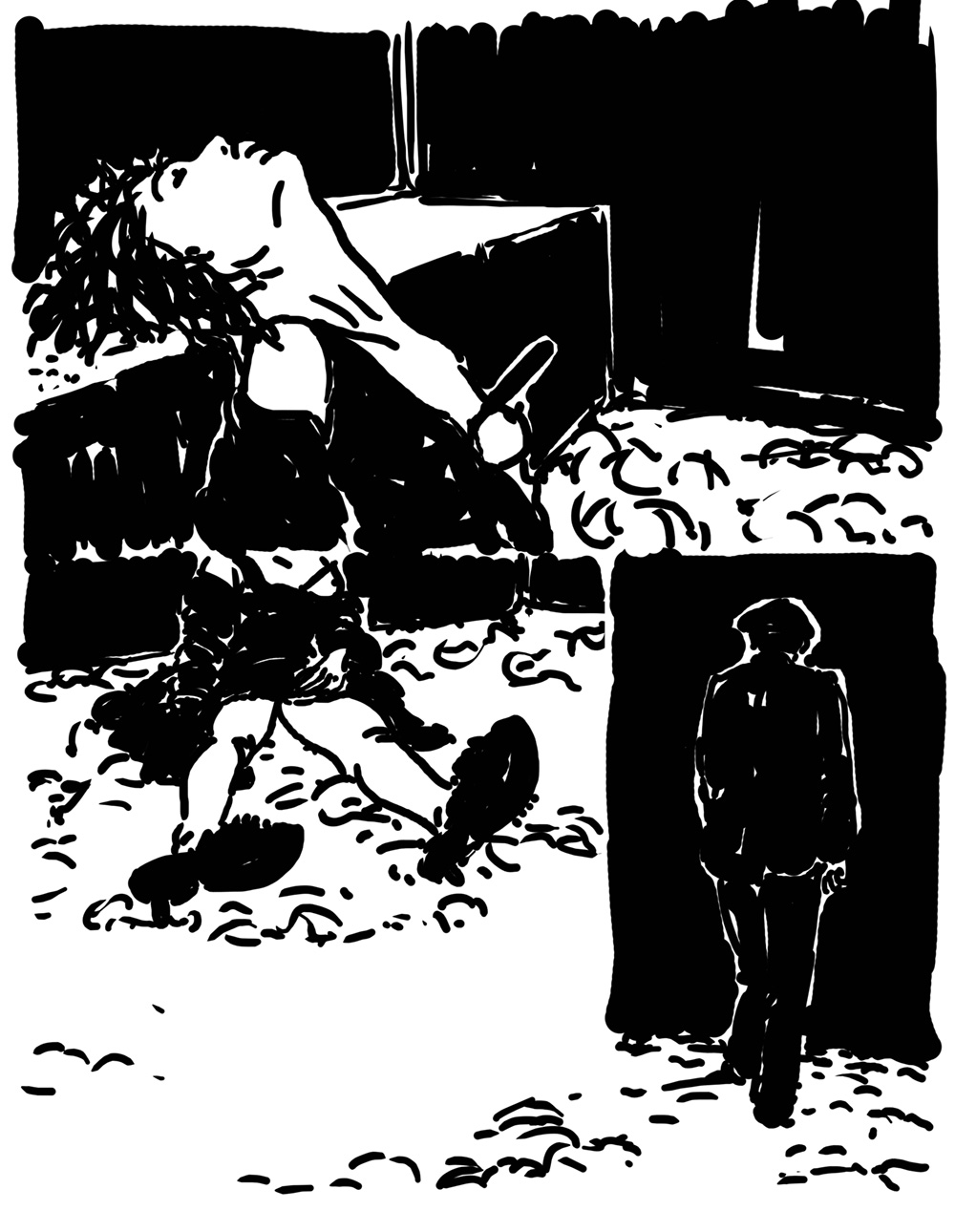
I already did a 200 pages b/w version of this story years earlier and decided later to make a color version of it.
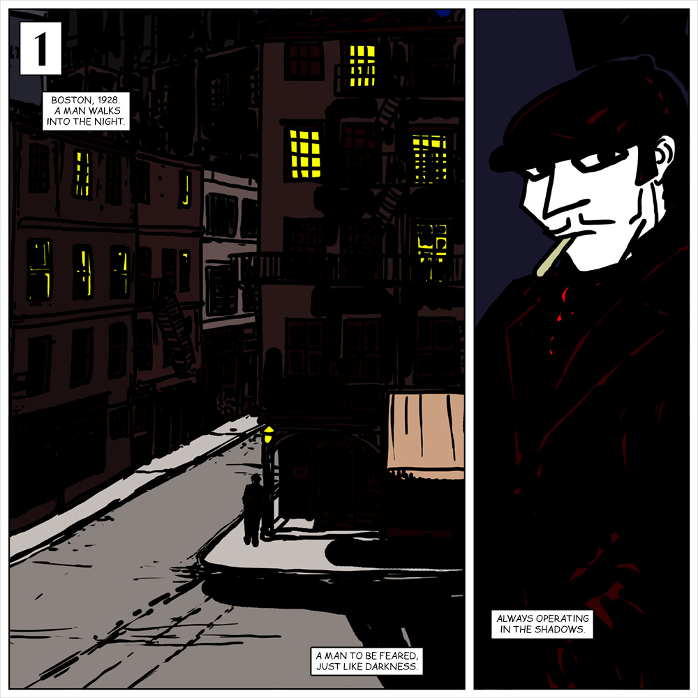
In the final version I didn't place, like in the original story, in Victorian London, but in 1920s Boston. Prohibition is in full swing and so is the underworld. It is ruled by the Irish Mob Gangs from South-East Boston, better known as Southie. The story: Jack "Knife" Doyle controls most of the brothels, Farris McLaughlin most of City Hall and the cops. Farris wants to takeover Jack's business, but that's easier said than done, because while Farris acts out of simple greed, Jack's interests lie elsewhere…
GRAPHIC NOVELS & Co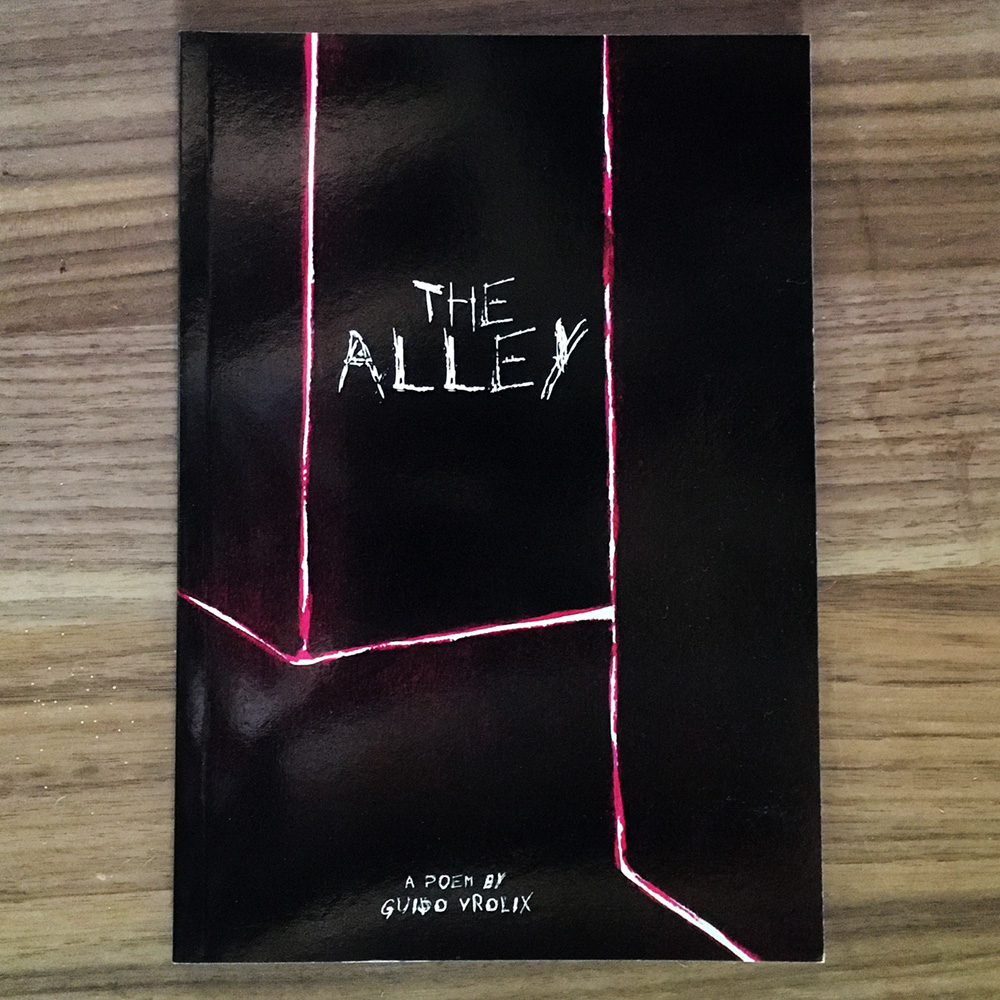
One of my first passions was poetry. Reading (like Joseph Brodsky and Bertolt Brecht) as well as writing it. As a matter of fact, there were whole periods in my life that I was writing and not painting, especially in my teens and twenties. So why not writing a poem, illustrate and publish it in a graphic novel form, I thought. That poem became “The Alley”, a long one in 59 stanzas.
GRAPHIC NOVELS & Co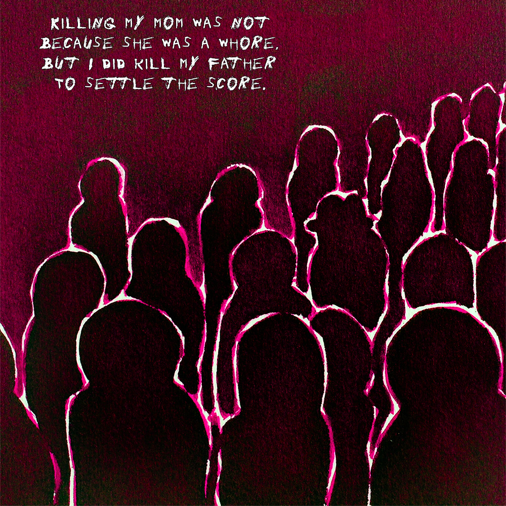
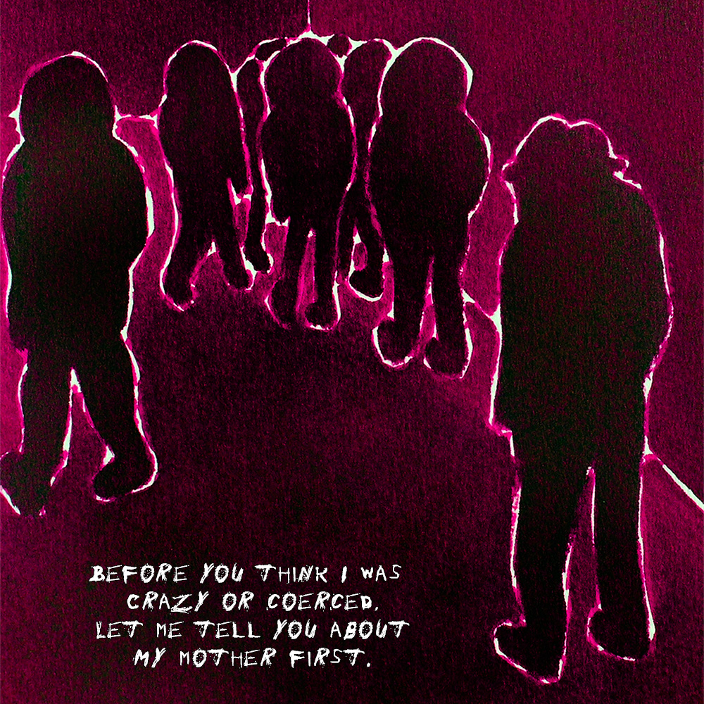
“The Alley”, a poem in 59 stanzas. The first stanza. “Every city has a dark side, with secluded byways and nooks and crannies where the light of day never shines. The Alley is a dark meditation on the seedy side of life, told in a series of monochrome pictures paired with poetry. This imagery is the unmistakable work of artist Guido Vrolix, showcasing dark silhouettes that even in their grimness are lined with an uncanny luminescence. You are invited to take a stroll into the looming shadows of The Alley.”