So now I was at the start of a new year.
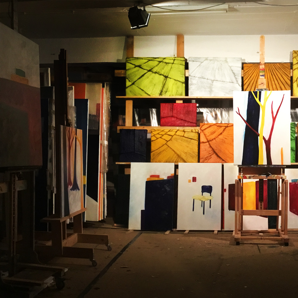
Although I started to use a glaze medium the year before, I decided to paint only with oil paint for a while, before I got carried away by technique. I needed more time to think about content and the best way for a painter to do that was on canvas.
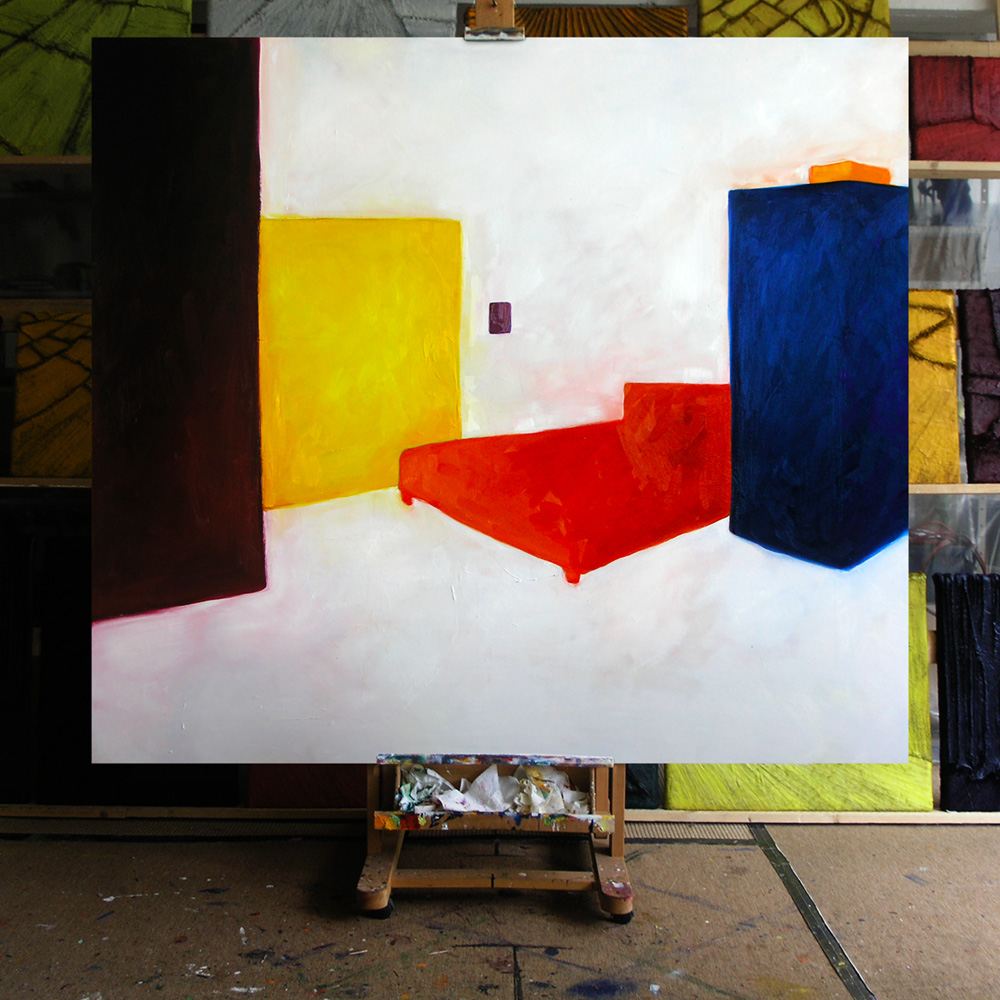
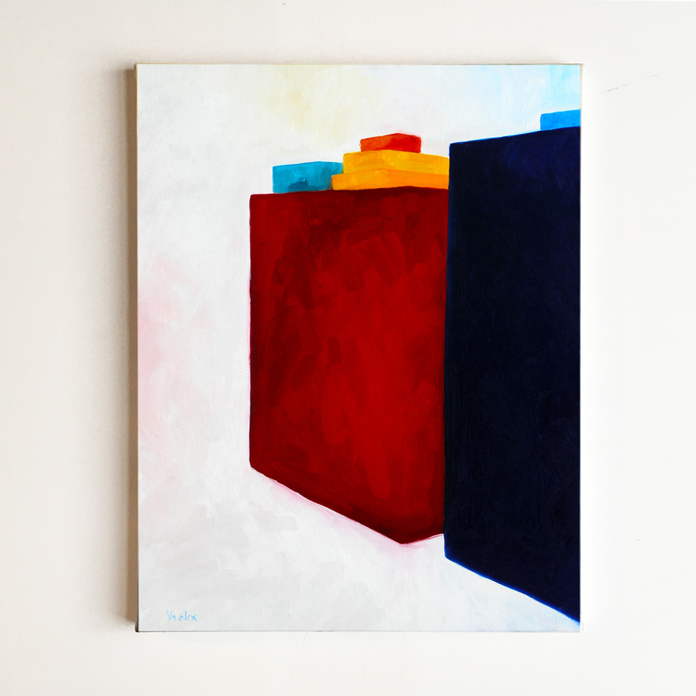
In a way these paintings were a further study of the silhouette and how it behaves in a certain space. “Red Bed” (oil on canvas, 160 x 180 cm).
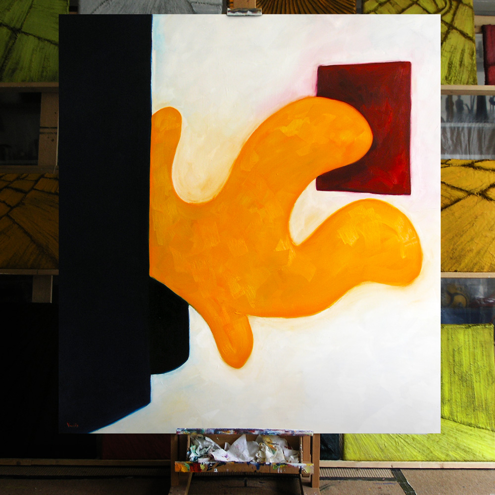
“Studio Monster” (oil on canvas, 164 x 180 cm). I also did a "monster" series. That is to say, I painted a whole bunch of paintings about a huge plant I had in my studio ones. Sadly it died. This one was the biggest.
Mai 30, 20:02 PM. Of course the main event that year wasn't in my artistic but in my personal life. We named her Nikki.
It would take some time before my daughter would show up in my work. All too emotional, I guess. I did made a small painting of the registration office where I had to declare my fatherhood. I called them my Kafka paintings. "Registration Office" (oil on canvas, 70 x 90 cm).
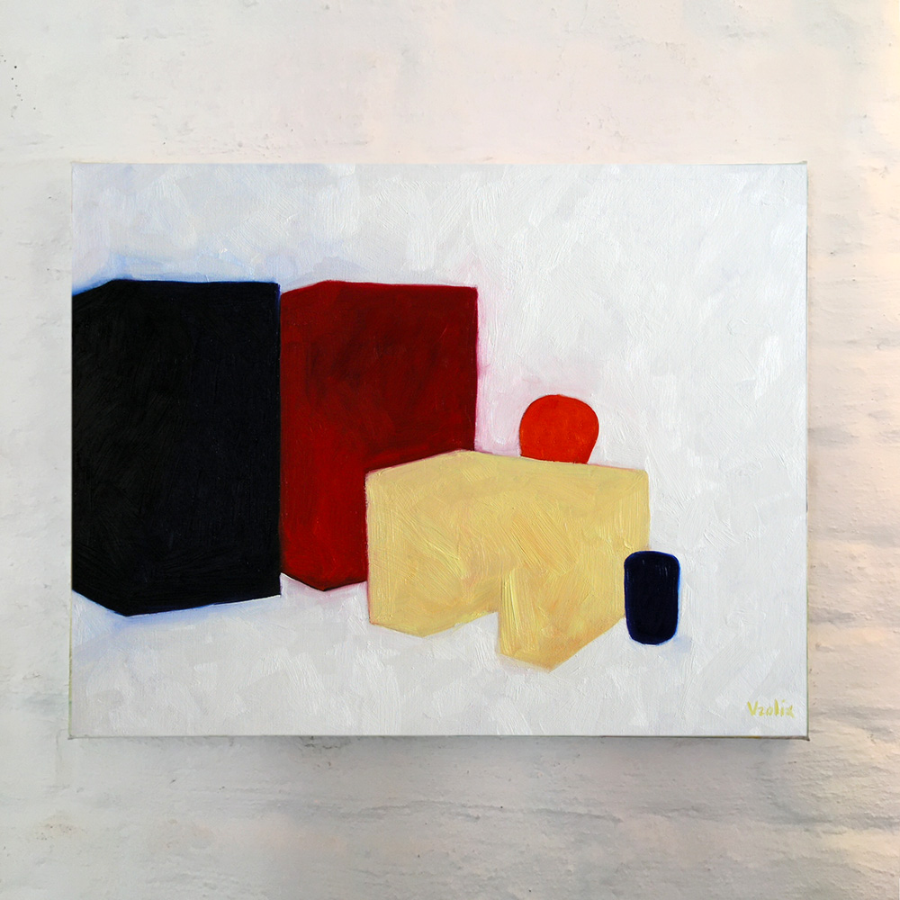
Sometimes I paint things that doesn't seem important, although they can be if you think about it. “Boxes” (oil on canvas, 70 x 90 cm).
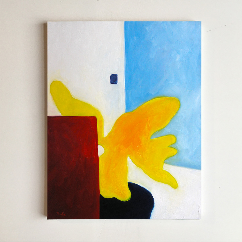
One more "Studio Monster" (oil on canvas, 70 x 90 cm)
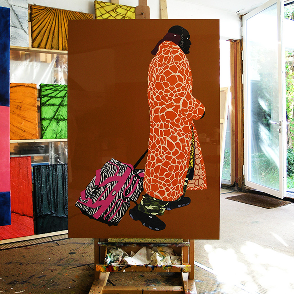
In 2014 I wrote: “So if you drew on a computer, it was useless to hide that fact and pretend it wasn't. That meant also that the eventual printout of the drawing couldn’t be done simply on paper, it had to be done in an equal industrial way. With other words, there would be no ‘hand’ in the result like with a normal drawing, painting or screen print, only an idea, a concept.” So I finally found the right method for producing my digital drawings as limited editions. “Prins Danny” (from the Homeless series), edition 1/5, print on aluminum panel, high gloss, 100 x 150 cm.
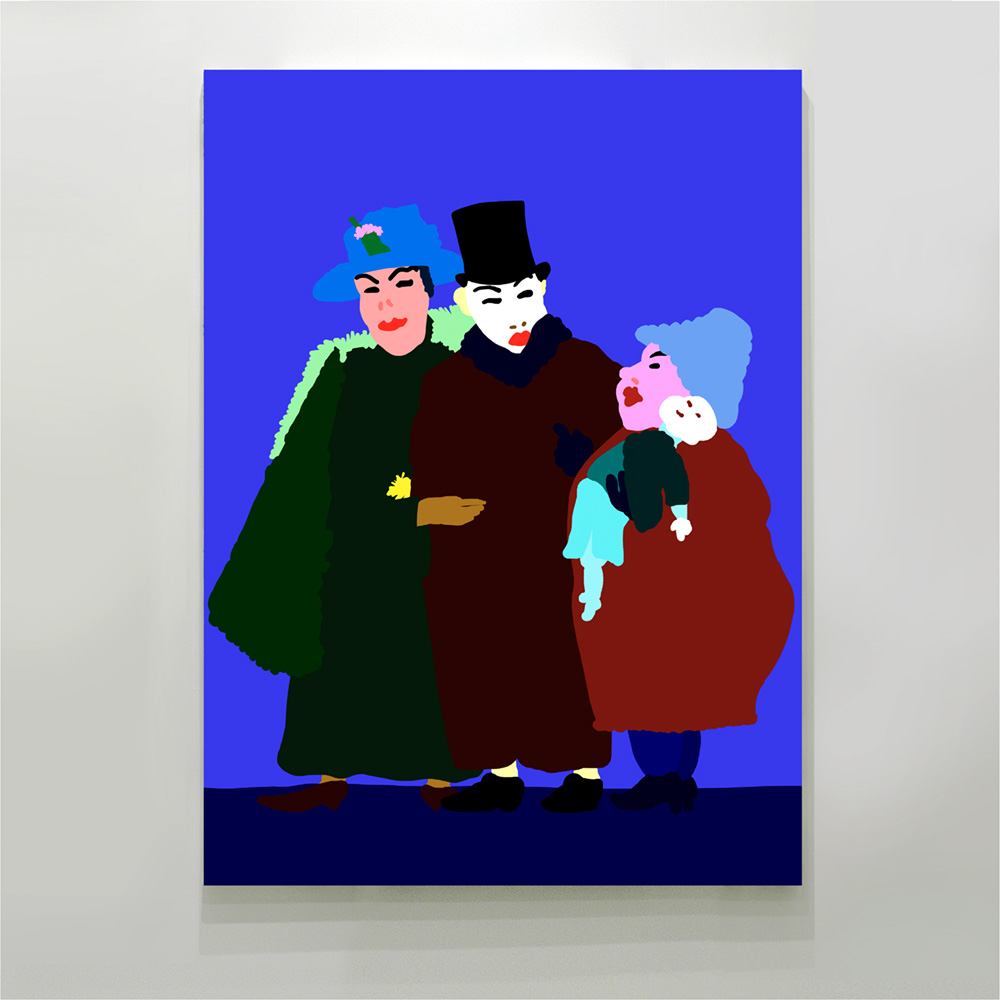
The editions: They were done in a printing technique that was actually a derivative from the 3D print. The ink was printed and then UV-heated (sublimation) on a aluminium panel and then coated with a Certified Liquid Gloss. The result leaves no doubt that everything you see (and feel) was done by a computer. And that of course was the whole point… “Intrigue” (after Ensor), edition 1/5, high gloss print on aluminum panel, 110 x 150 cm.
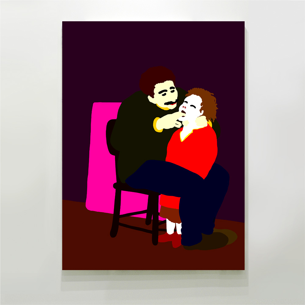
I always looked at the old and not so old masters. They are my teachers, they inspire me but most important, they show me the way. Or to put it in other words, I follow the work. (With that I meant that I paint by instinct and inspiration, never by theory.) “El Primero” (after Goya), edition 1/5, high gloss print on aluminum panel, 110 x 150 cm.
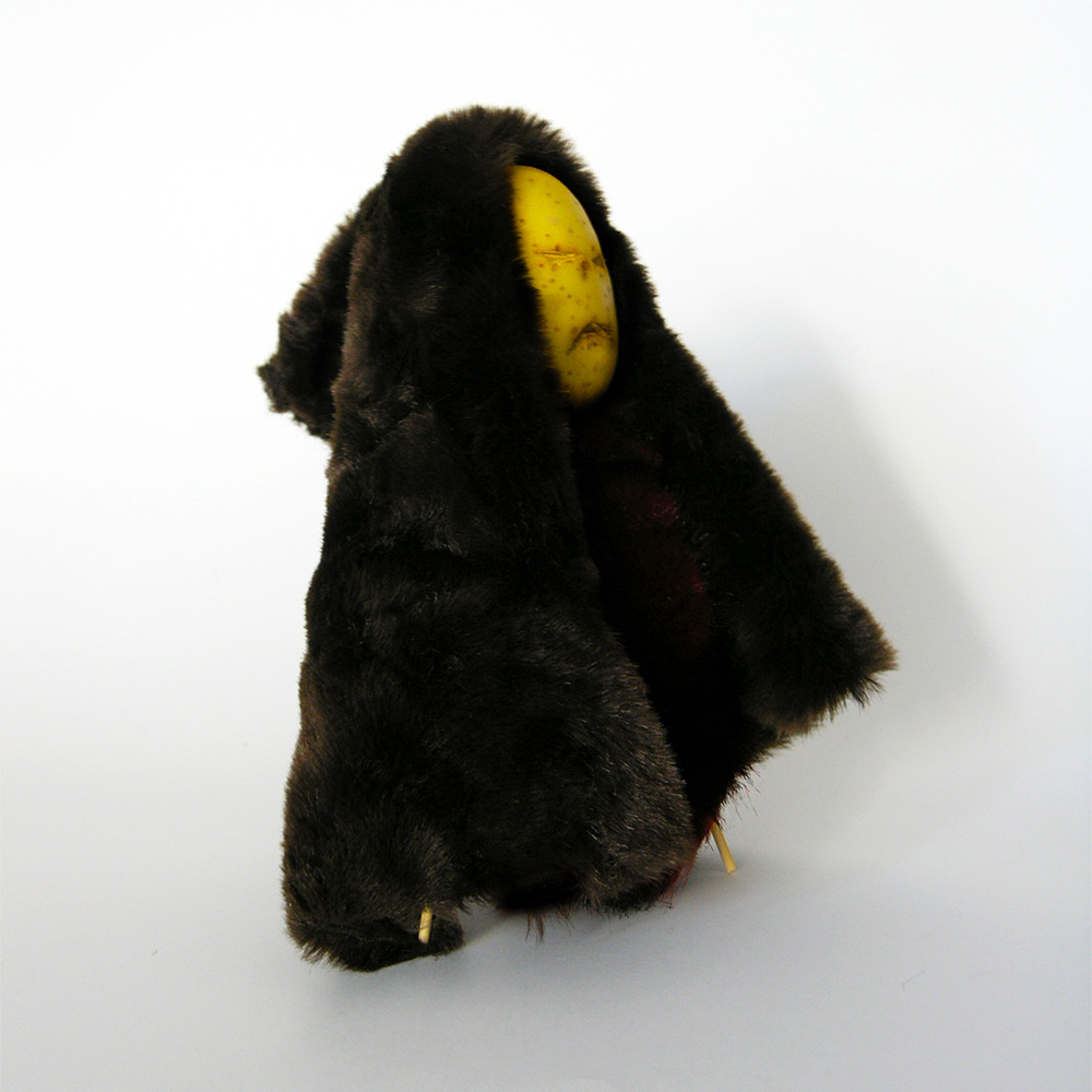
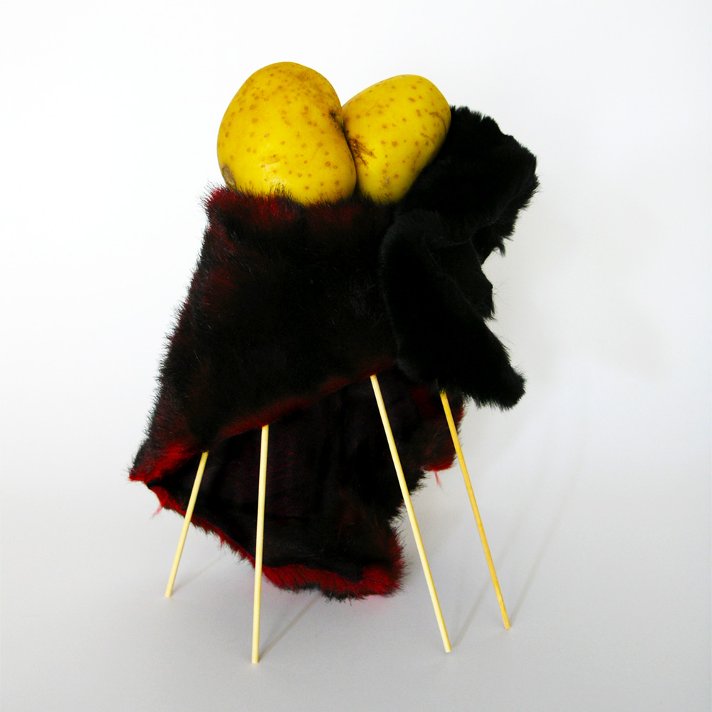
In 2006 I made a small series of potato sculptures called “Winter People”. (Amazing what you can do with a potato, wooden sticks and some leftover pieces of artificial fur.) Potatoes age in an interesting way, like growing older, a bit like in real life but faster. They're fun to do, so I did a new series. The end result of course is not a small sculpture (they last only a month or so), but the photo along the way. “The Traveler” (limited edition, giclée print, 100 x 100 cm).
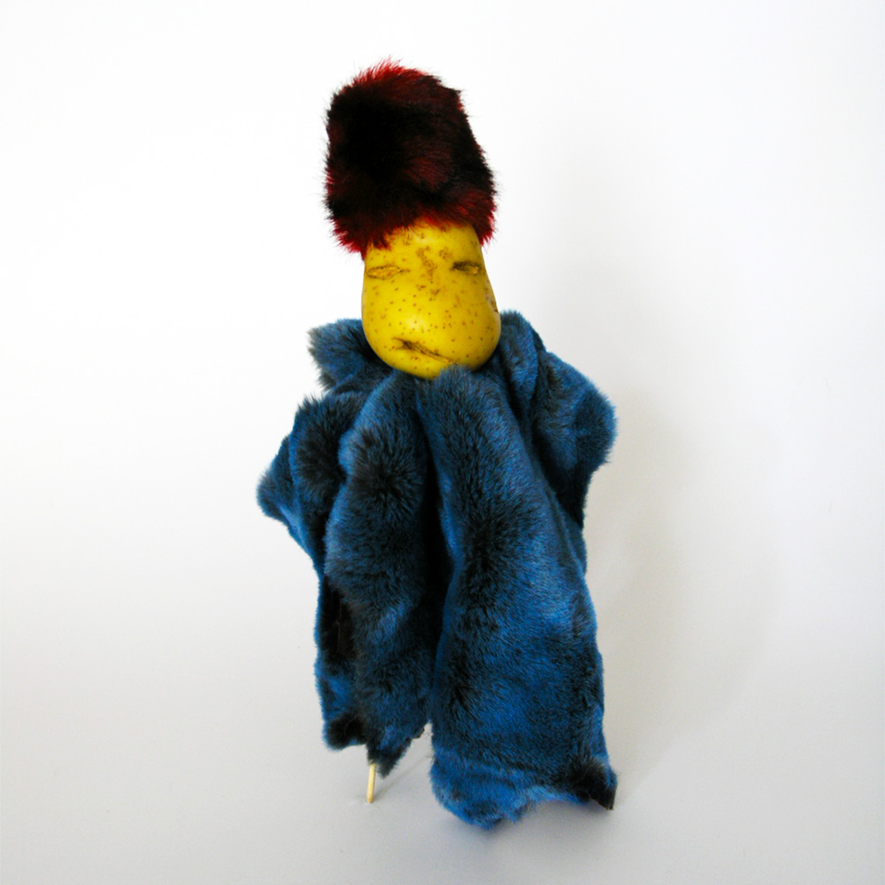
“The Emperor” (limited edition, giclée print, 100 x 100 cm).
“The Kiss” (limited edition, giclée print, 100 x 100 cm).
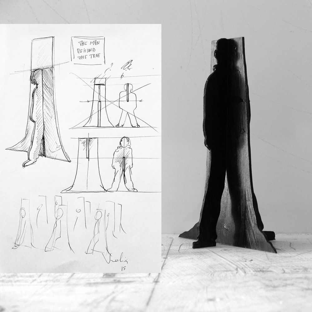
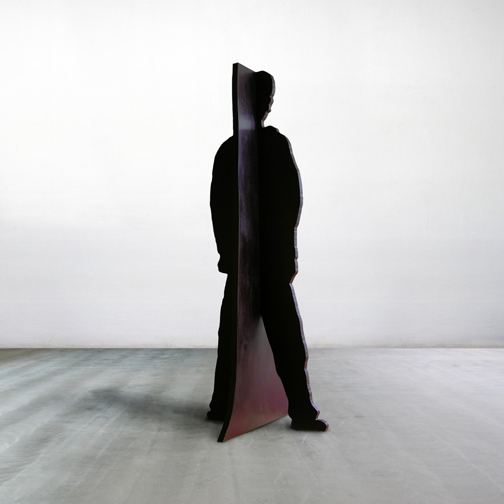
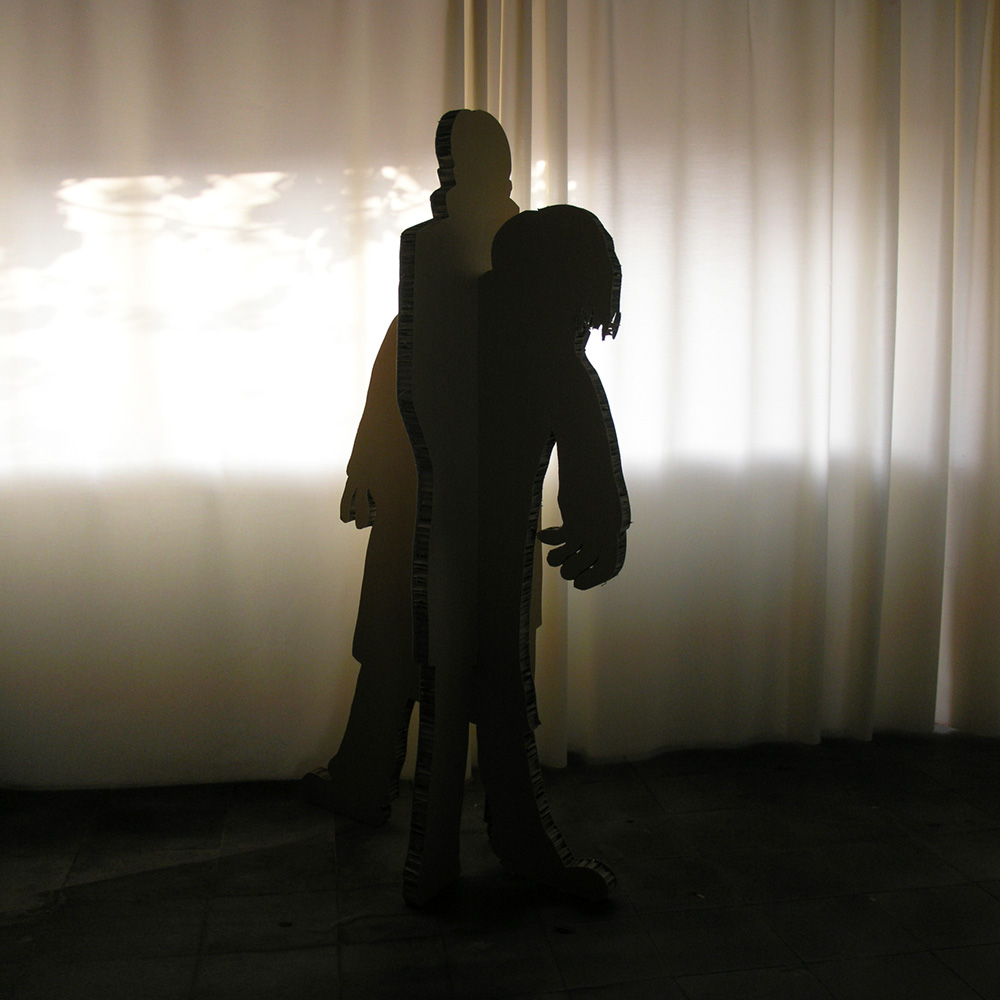
The potato-head sculptures were just a kind of warm up. For a while a felt the urge to create some sculpture again. The last ones I did were already from 2006. (Not including the installations and set designs, of course.) The first one was "Man Behind The Tree". I already started sketching and making a some models late 2015. These new sculptures were based on the idea that two parts from the same piece of plywood were fitted back together again with a quarter turn, so that one part showed a profile and the other the front view, thus forming a 3D image.
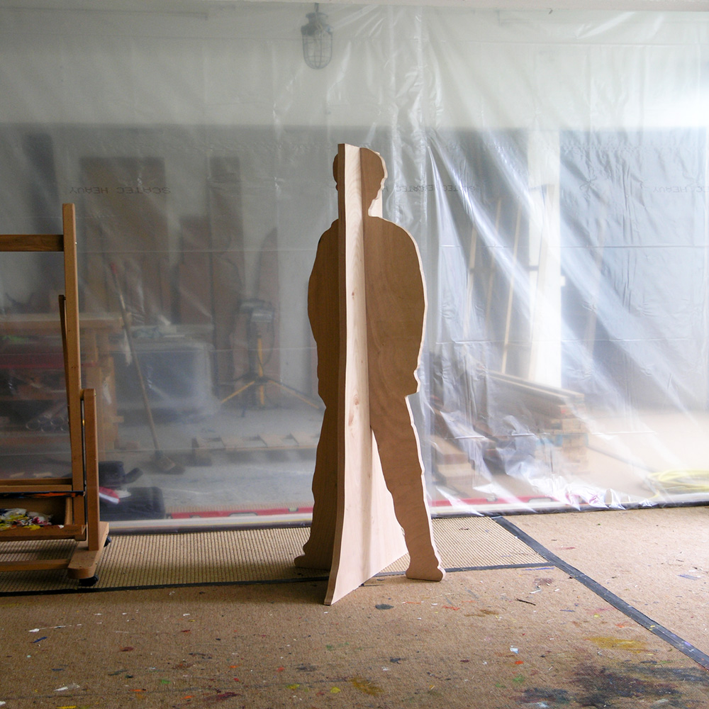
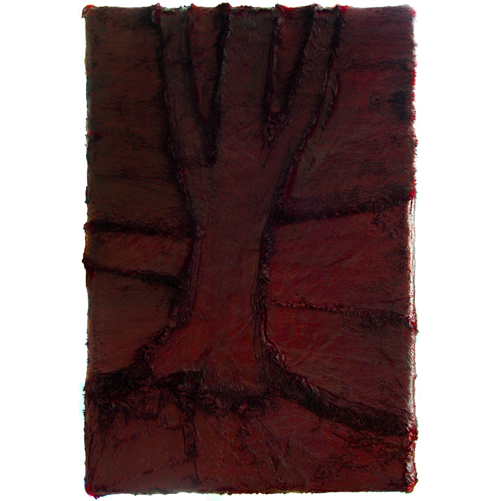
The sculpture "Man Behind The Tree" was cut out of a single piece of plywood. One part was the silhouette of a tree, the other that of a man. Depending from where you were standing the man could be hiding behind the tree. "Man Behind The Tree" (okoume plywood, 3 x 66 x 80 x 179 cm).
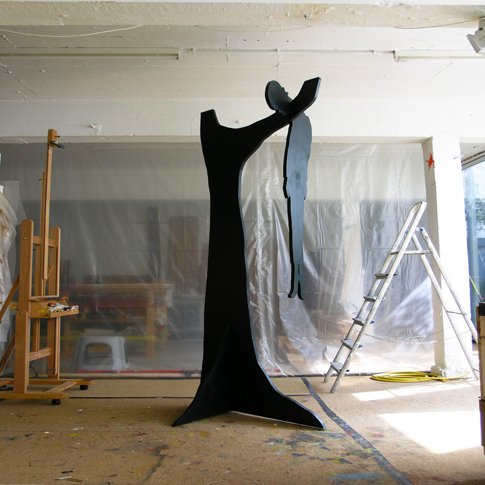
Finally I painted the sculpture as a monochrome with the color maroon. "Man Behind The Tree" (monochrome maroon, okoume plywood, 3 x 66 x 80 x 179 cm).
“Field of Honor” (monochrome N7 neutral grey, okoume plywood, 3 x 102 x 122 x 160 cm). It was inspired on D-day, the Allied invasion of Normandy during World War II. Ideally this sculpture would be made from steel.
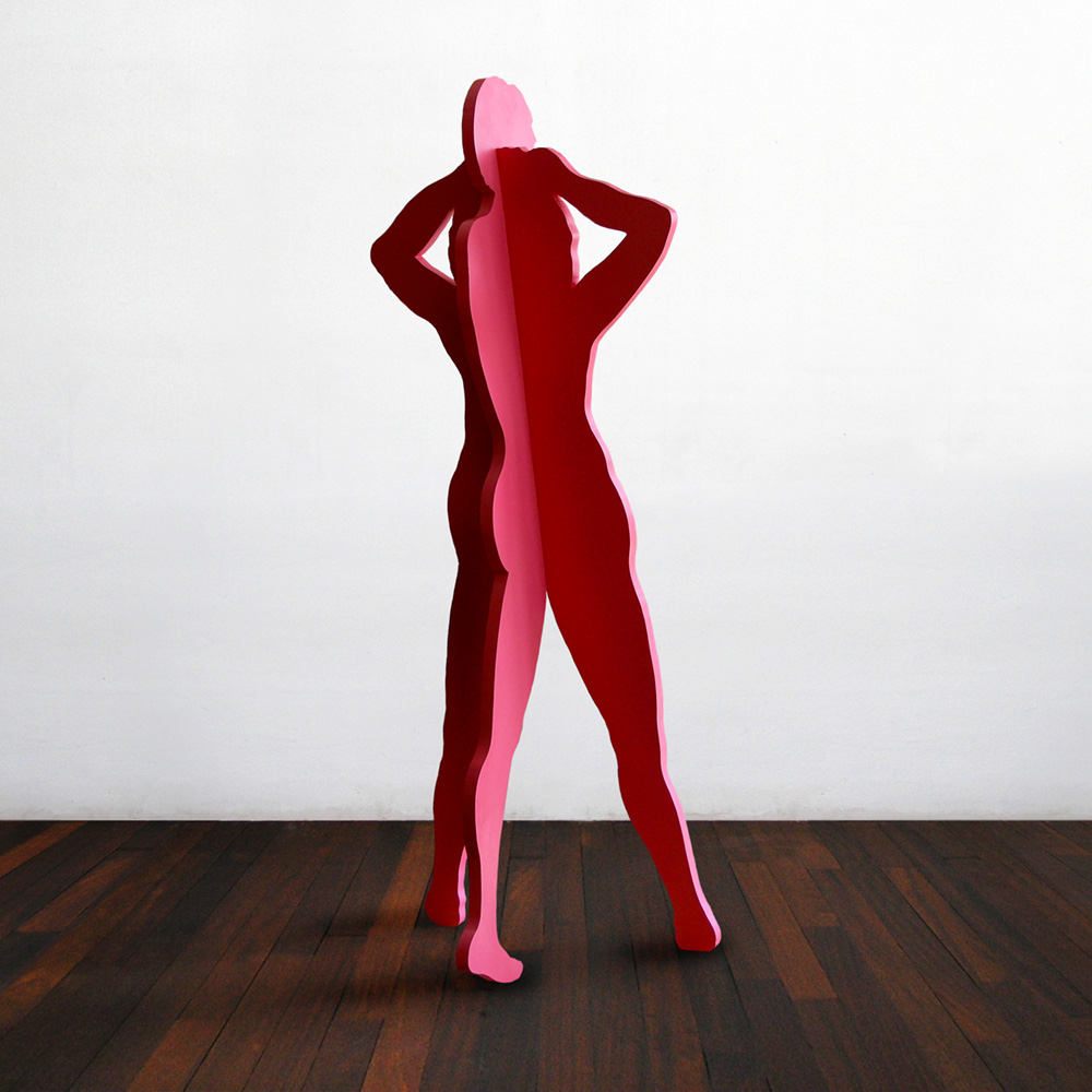
“The Unexpected” (monochrome light magenta, okoume plywood, 3 x 54 x 76 x 185 cm). It's a couple making out. A bedroom sculpture, so to speak.
“Southern Tree” (monochrome Jenkins green, okoume plywood, 3 x 122 x 122 x 250 cm). After a photograph of a lynching in the American South.
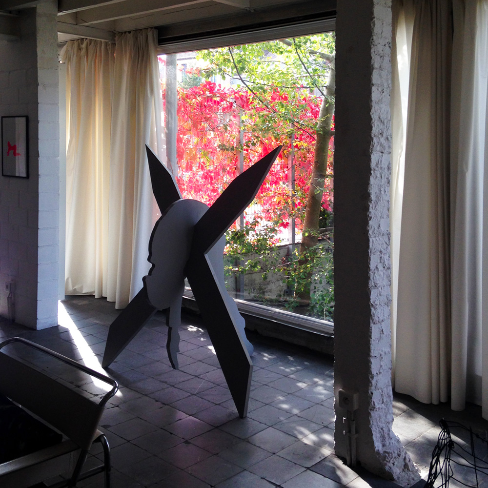
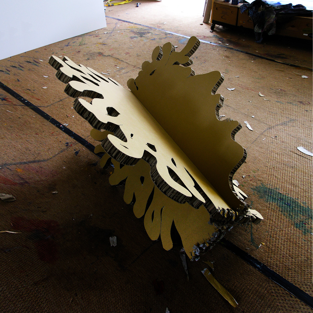
“Dr. Jekyll & Mr. Hyde” (honeycomb cardboard, 4 x 53 x 82 x 183 cm). Based on the gothic novella from Robert Stevenson, 1886, about a London legal practitioner named Gabriel Utterson who investigates strange occurrences between his old friend, Dr Henry Jekyll and the evil Edward Hyde.
"Head Of Medusa" (honeycomb cardboard, 4 x 103 x 118,5 x 120 cm). In Greek mythology, Medusa was one of the three monstrous Gorgons, generally described as winged human females with living venomous snakes in place of hair. Those who gazed into her eyes would turn to stone. Medusa was raped by Poseidon then beheaded by Perseus, who thereafter used her head, which retained its ability to turn onlookers to stone, as a weapon until he gave it to the goddess Athena to place on her shield. In classical antiquity the image of the head of Medusa appeared in the evil-averting device known as the Gorgoneion.
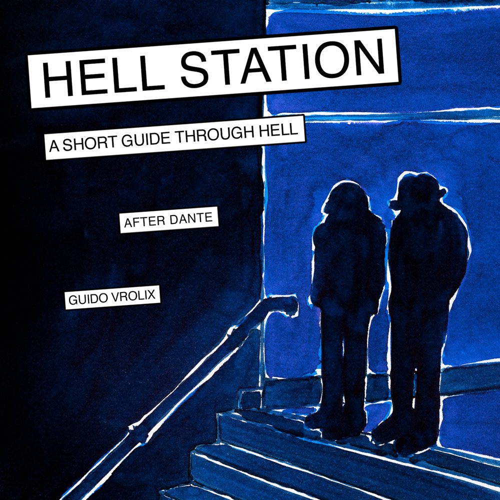
During a holiday in the South of France (2003), I took along the latest translation of “La Divina Commedia” by Dante. The Mediterranean climate was exactly right to create a visual interpretation of the Inferno, except for the fact that I placed Dante's story in a modern day subway. Taking the train to Hell, you could say. “There's a train station called Hell, Above the entrance a strange spell, Warning all who take the journey down, Abandon all hope if you go to town.” I had to wait until I had my own publishing company - Vrolix Graphics - before I could get it out there. It was published under the title "Hell Station".
GRAPHIC NOVELS & CoMURMUR - WHEN PARADISE STINKS! This Graphic Novel came about after I was rereading my favorite SF-writer from when I was a boy, Jack Vance. That and the fact I never created a SF Graphic Novel before. It became what was basically a detective story, but taking place in a total different world and time. It could easily be on one of the many worlds inside the universe that Jack Vance created. I got a bit carried away I'm afraid, and ended up with a nearly a 400 pages graphic novel, eventually published as a series of 4. The story: Murmur, a paradise like planet, isn't a backwards planet, not even a poor one. Just rather out of the way. And of course there is no world, no matter how splendid, that could call itself a paradise without the proverbial fly in the ointment. In the case of Murmur, a water planet with no land area to speak of, the stink in the water. After ten years in the marine corp, Jack Wall retired to his home planet Murmur.
GRAPHIC NOVELS & Co
In February in created the blog "Our Daily Nobo". It's a daily blog in cartoon form about the absurdity of ordinary life and human behavior. The name (or species) Nobo is actually a contraction of the words Bonobo & Nobody.
OUR DAILY NOBO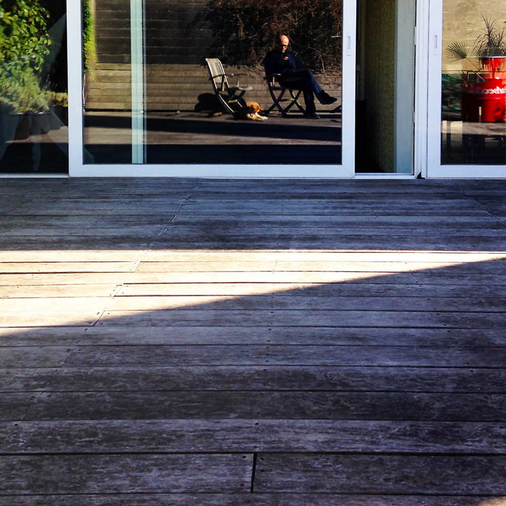
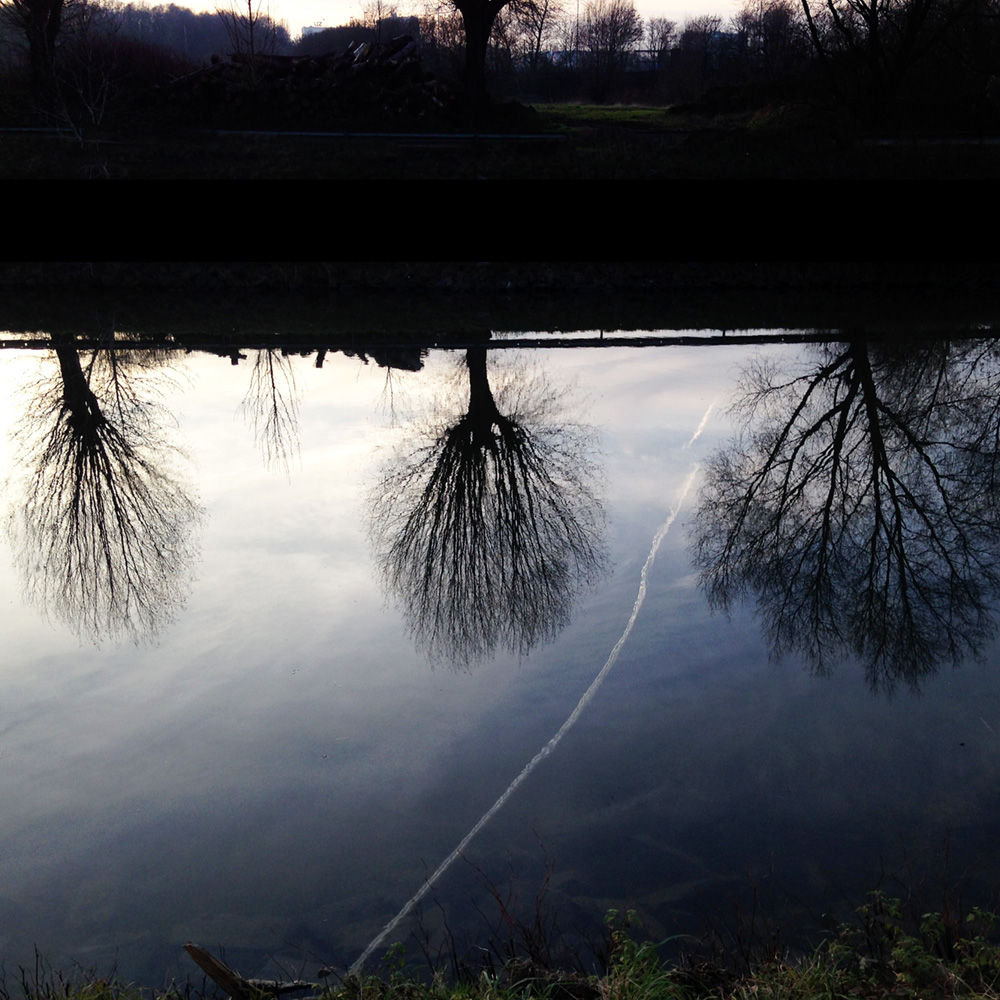
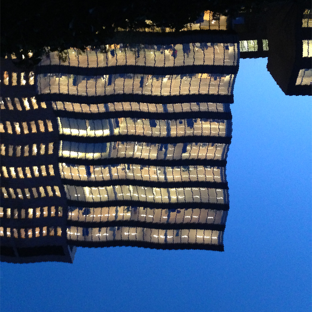
When I got myself a new phone, I started to make pictures again. I always had periods that I did that, quite intensely actually, but it was the first time I used a phone to do so. I named these picture series my “Walking with Gin” (Gin being my Shiba Inu dog). Hence, for the most part, landscapes.
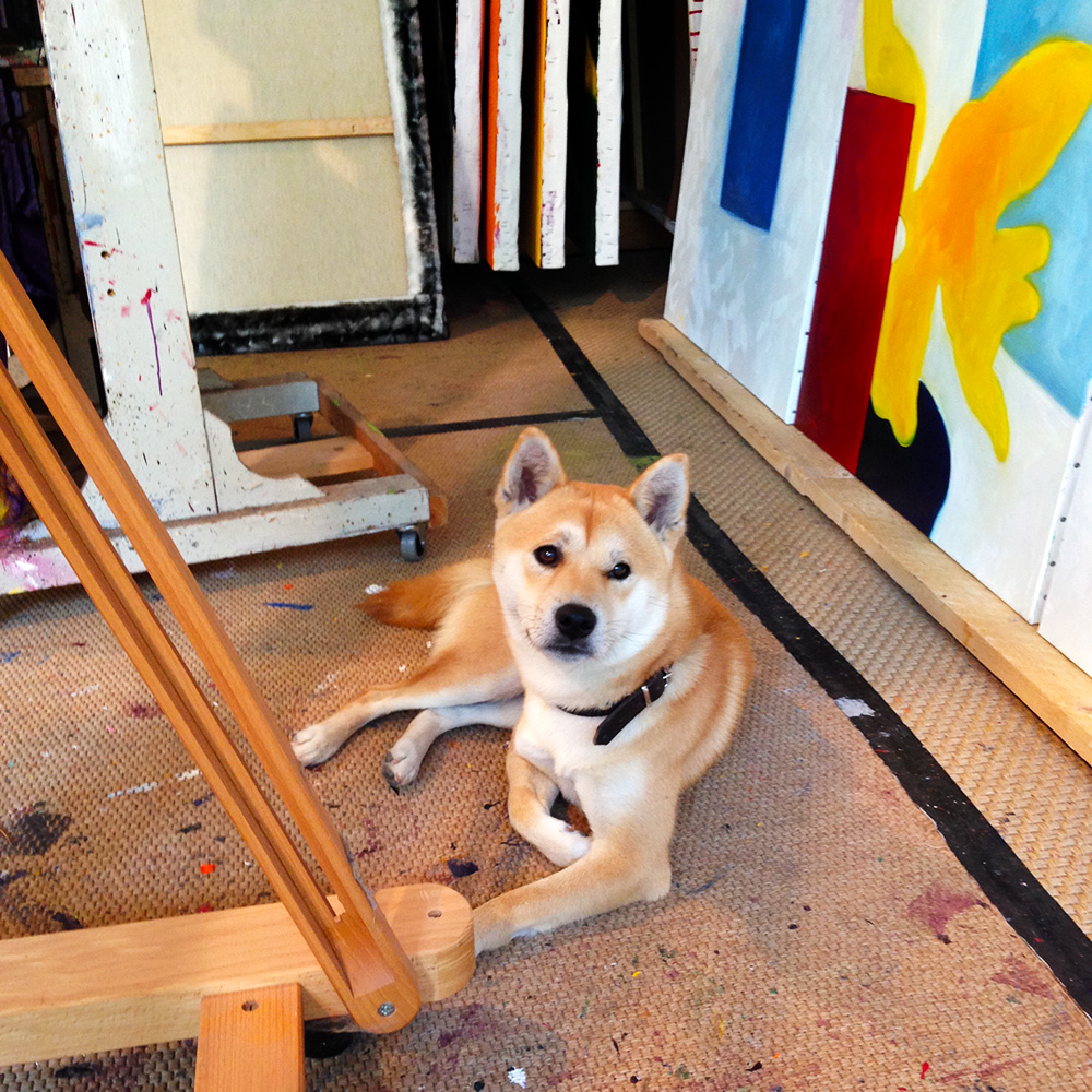
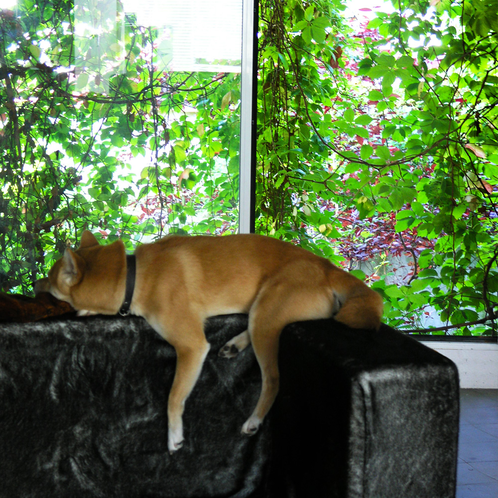
Studio view with my assistant “Gin”.
"Winter Mirror" (From the series “Walking with Gin”.)
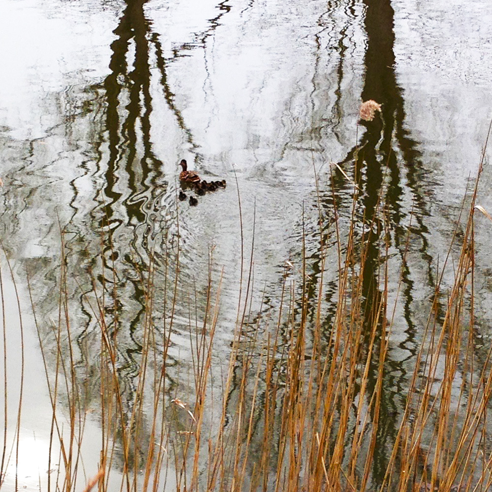
"Water Works" (From the series “Walking with Gin”.)
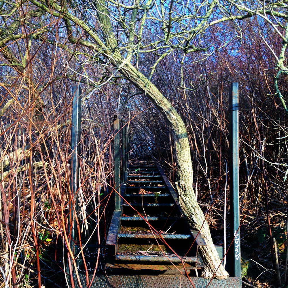
"Early Spring" (From the series “Walking with Gin”.)
"Autumn" (From the series “Walking with Gin”.)
"Indian Summer" (From the series “Walking with Gin”.)
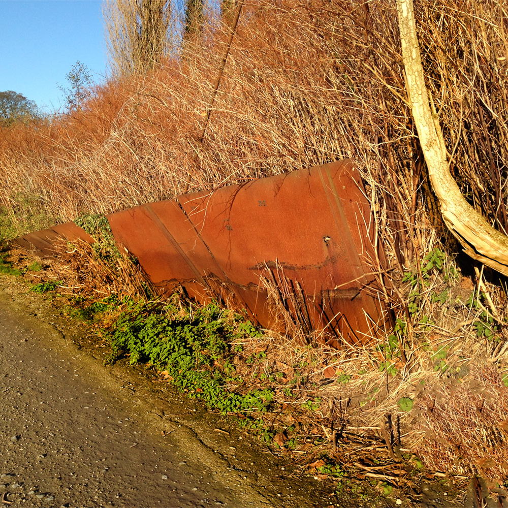
"Forgotten Gate" (From the series “Walking with Gin”.)
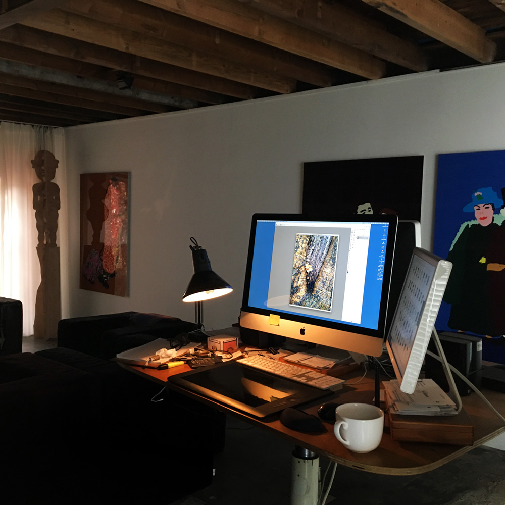
All the photographs of the series "Walking with Gin" were taken with an iPhone, but that was just half the work. For me, taking a picture was as if I would be making a drawing, painting or a set design. I always took some pictures when I saw something that was like a little story, even when that story wasn't really there, at least not in an obvious way. By running these pictures through photoshop I tried to find the story I imagined in the first place. It wasn't a question of putting things inside the picture that weren't there, but manipulating it until it did.
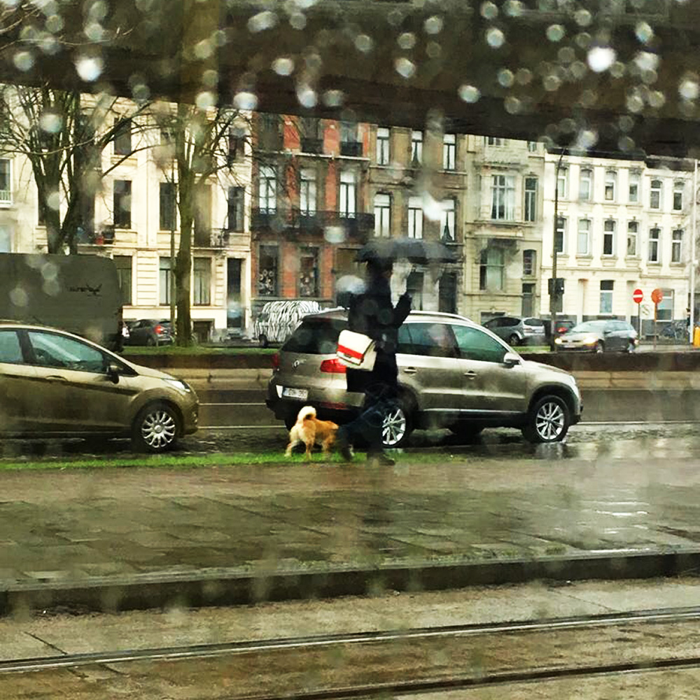
The only picture I didn't make, was this snapshot taken from a passing streetcar during my walk with Gin...
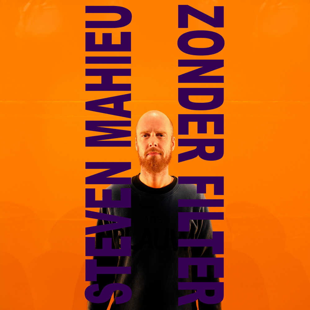
The set design I did that year wasn't in theatre but for standup comedian Steven Mahieu.
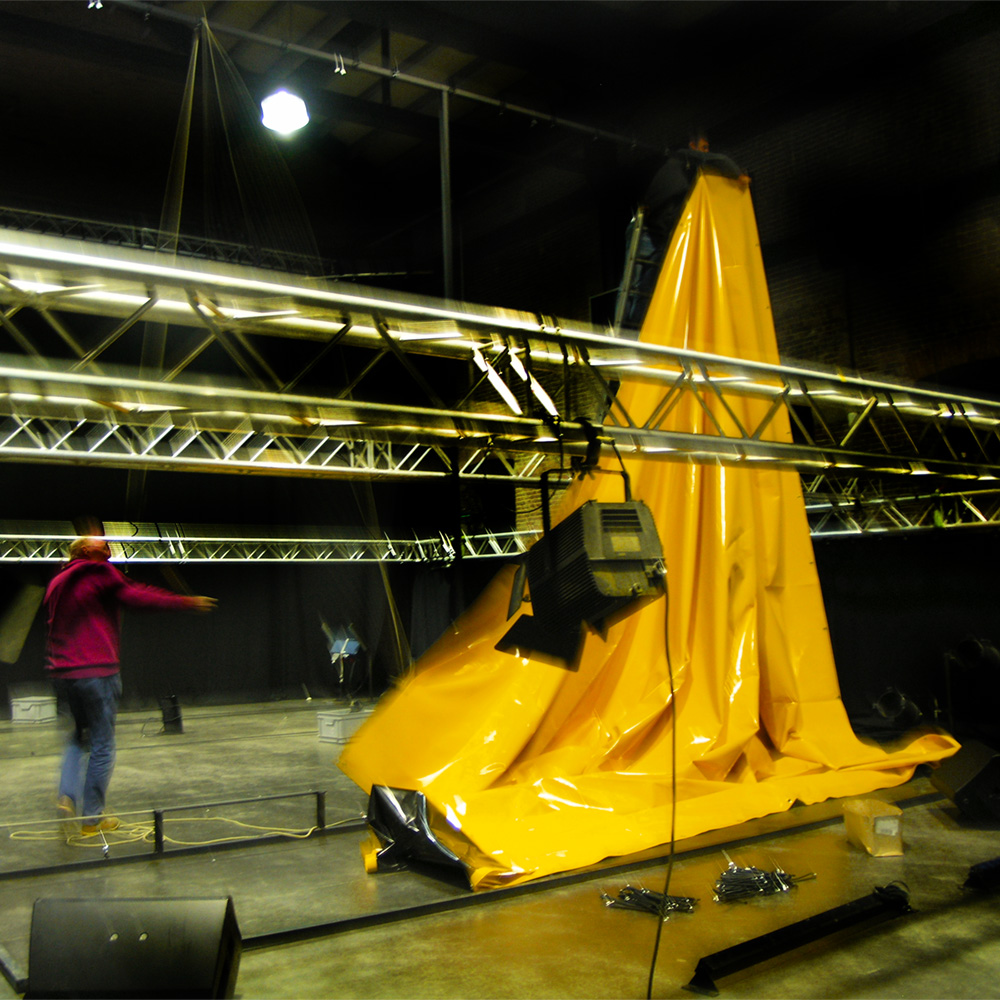
Designing a set for a standup act wasn't comparable with that for a play, it just looked that way. There wasn’t any narrative in a standup show, no "place" to start with. I realized after a while that it had to be abstract, something that determined movement, not story.
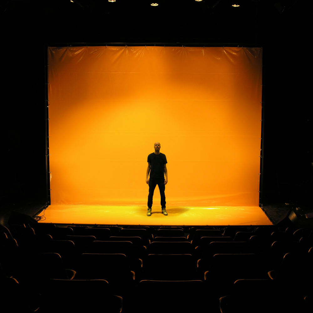
A standup act was a something "in your face" kind of thing. So what I did was just that, pushing the comedian into the audience faces.
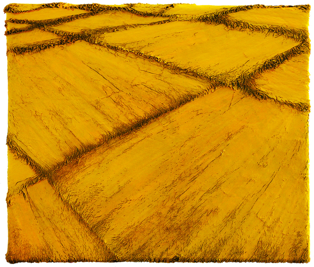
At one time I felt like making another fur-painting series, but a lot smaller than I usually make them. "Harvest" (oil on artificial fur, 61 x 71 cm).
Small fur-paintings doesn't sound particularly special, but fur-paintings usually work better in bigger sizes because, in contrast to a "normal" painting, the brush was actually the fur itself, and you couldn't just pick up a smaller brush. "Rice Fields" (oil on artificial fur, 61 x 71 cm).
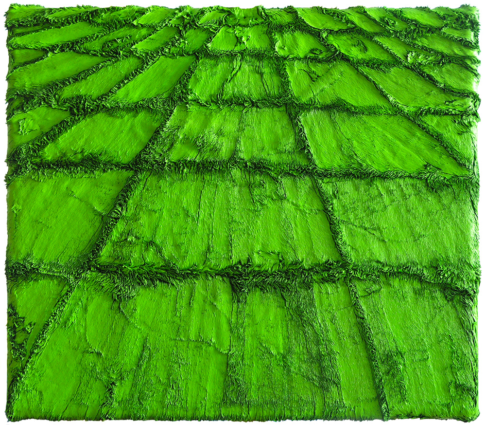
Luckily I had some fine haired fur lying around in the studio. "Afterglow" (oil on artificial fur, 41 x 62 cm).
It became quite a series…