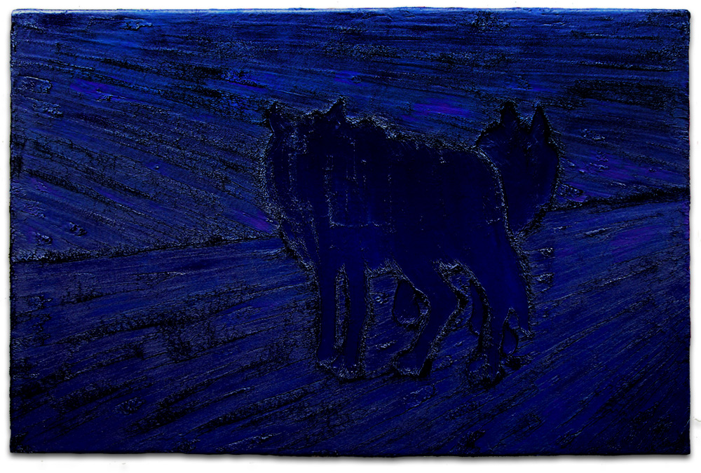
As I ended last year with a fur-painting of a wolf, so started the next with some more wolves. "Midnight" (acrylic & oil on artificial fur, 135 x 200 cm).
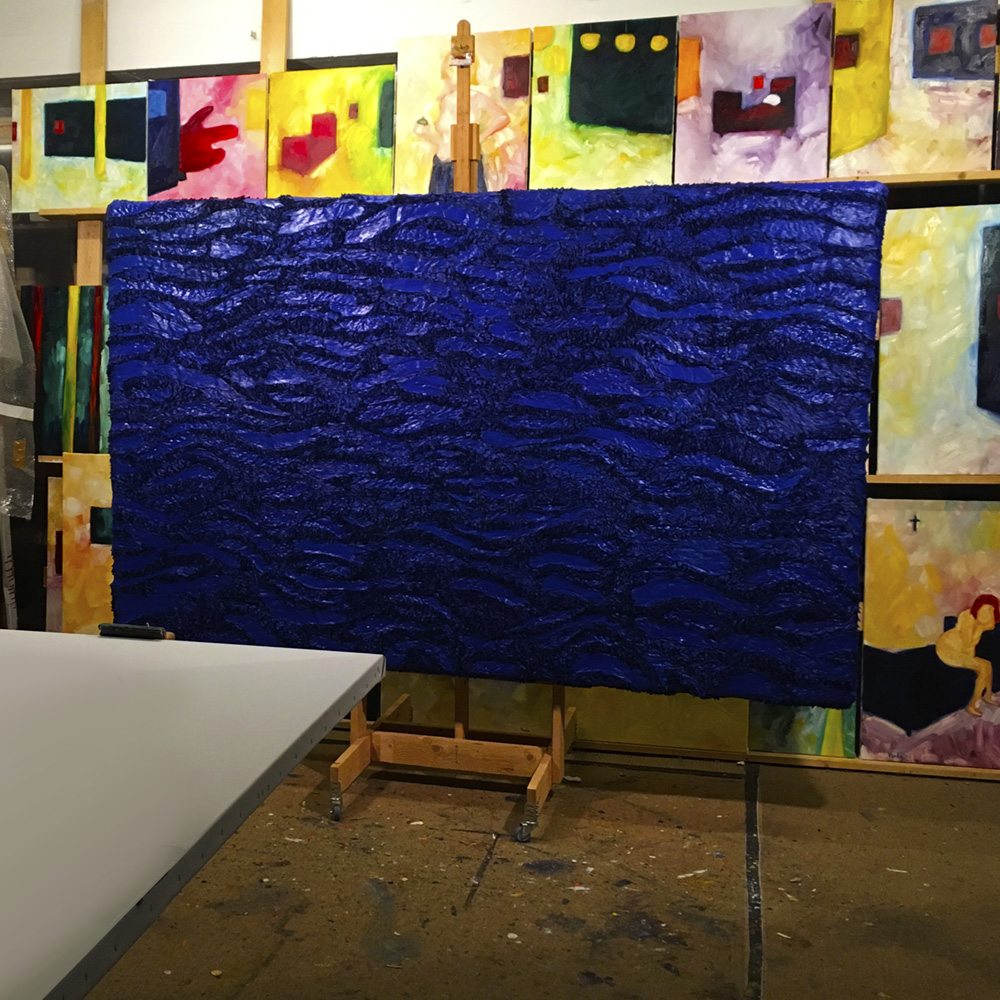
I also did another seascape in the ever growing fur-painting series. "Deep Blue Sea" (acrylic & oil on artificial fur, 150 x 242 cm).
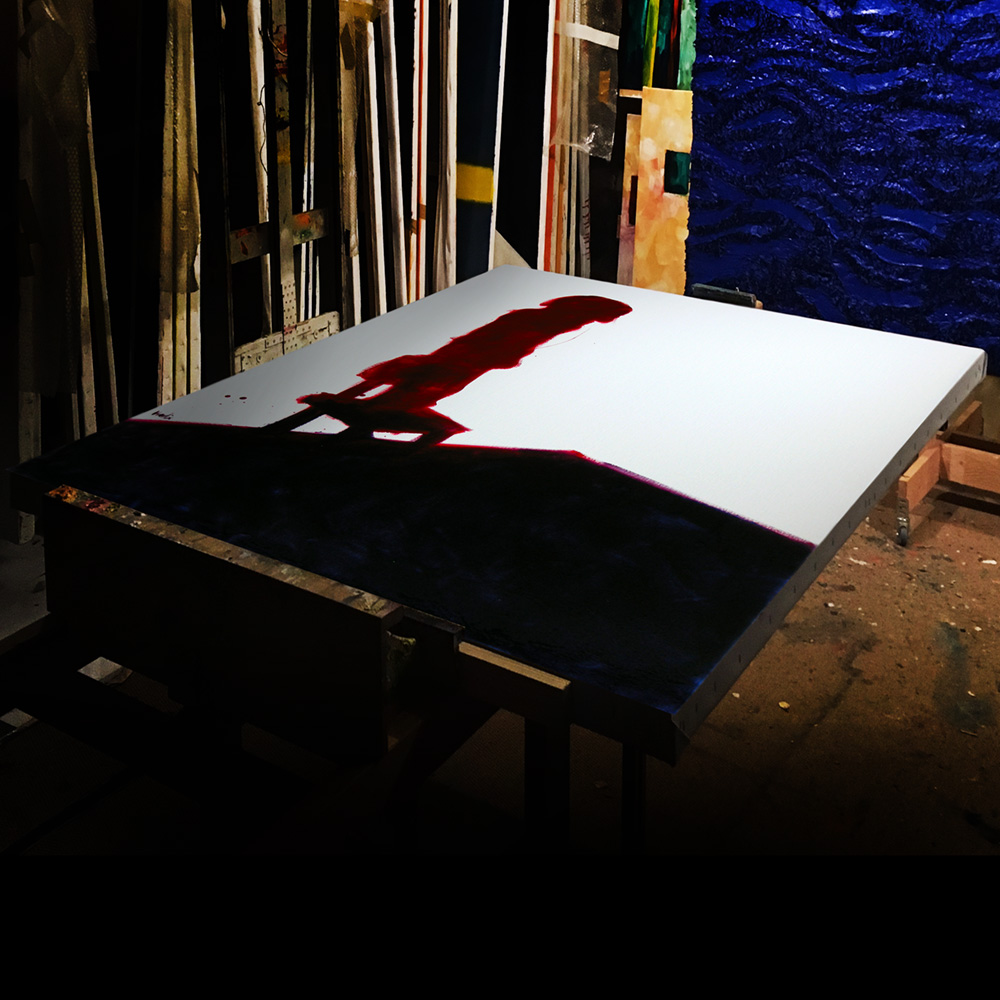
I piled up quite a collection of fur-paintings over the years, although that was just one corner of the studio, so to speak.
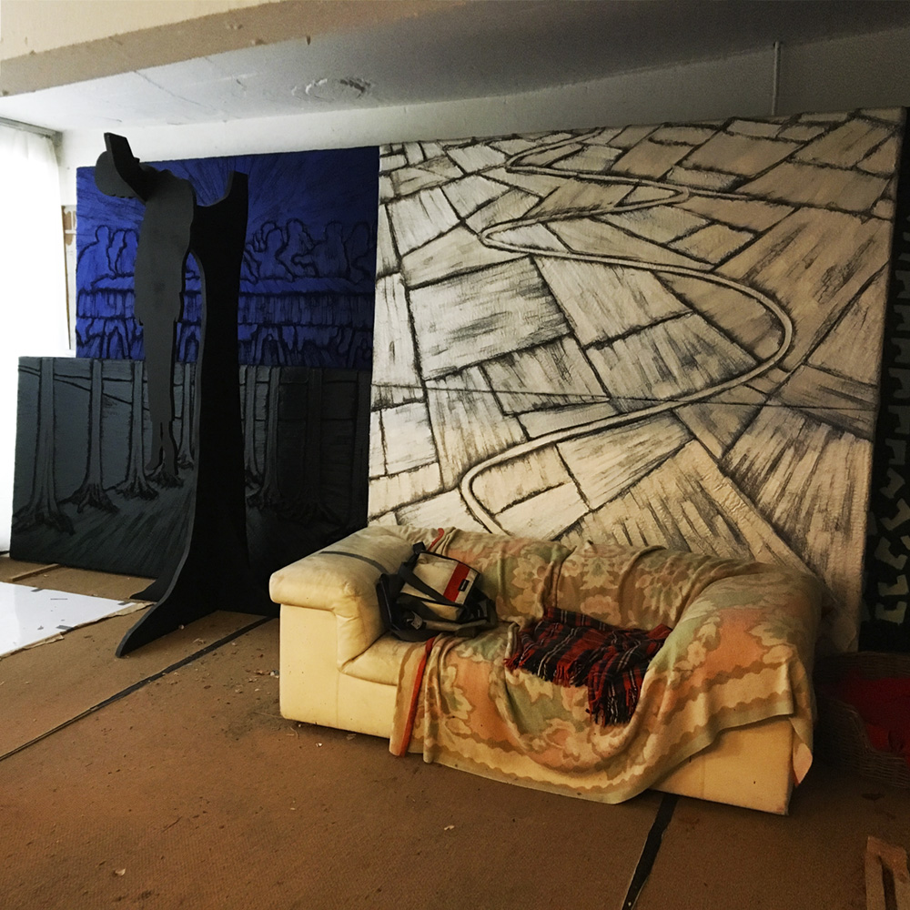
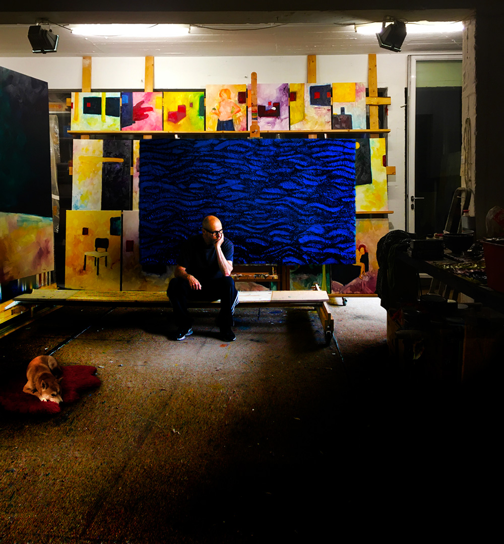
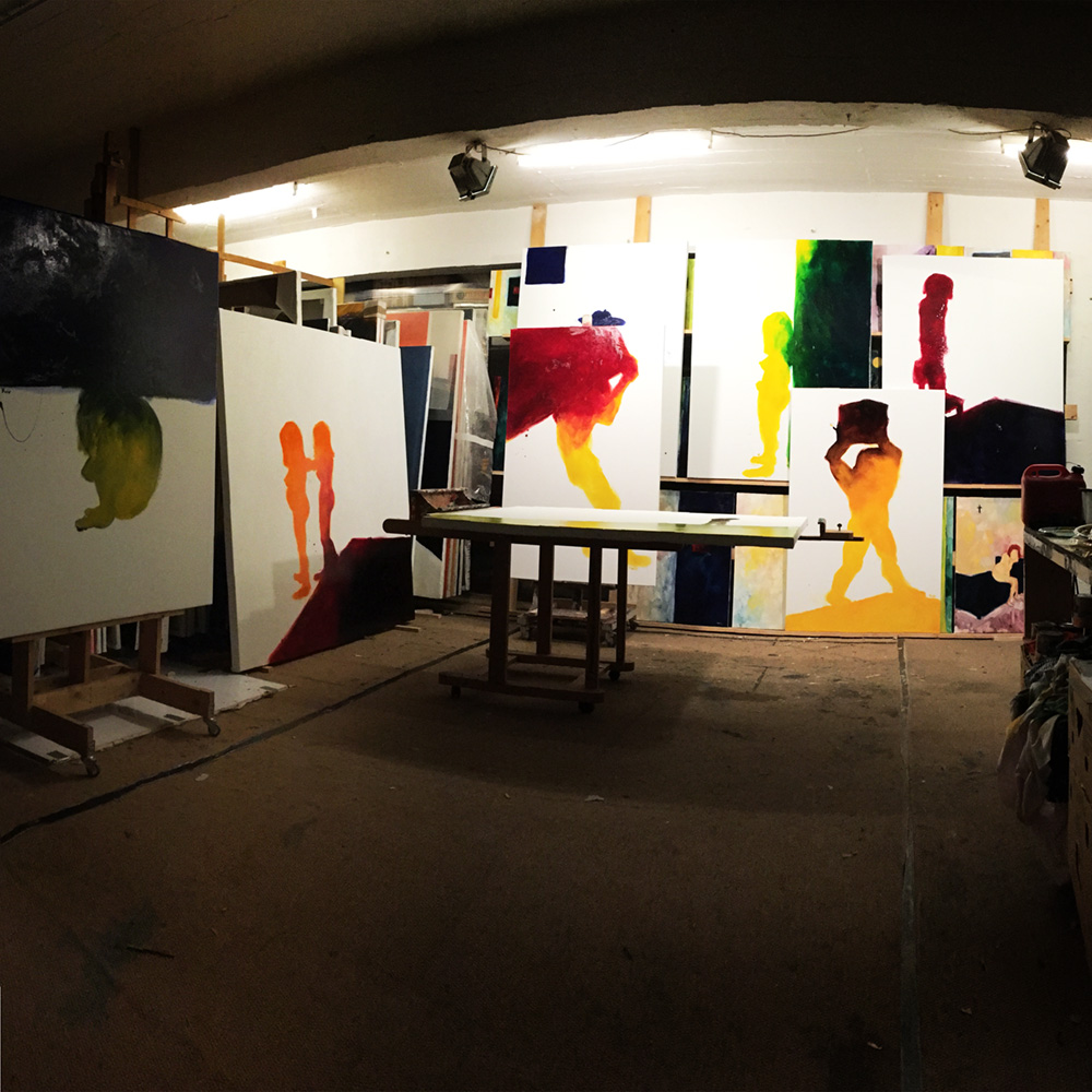
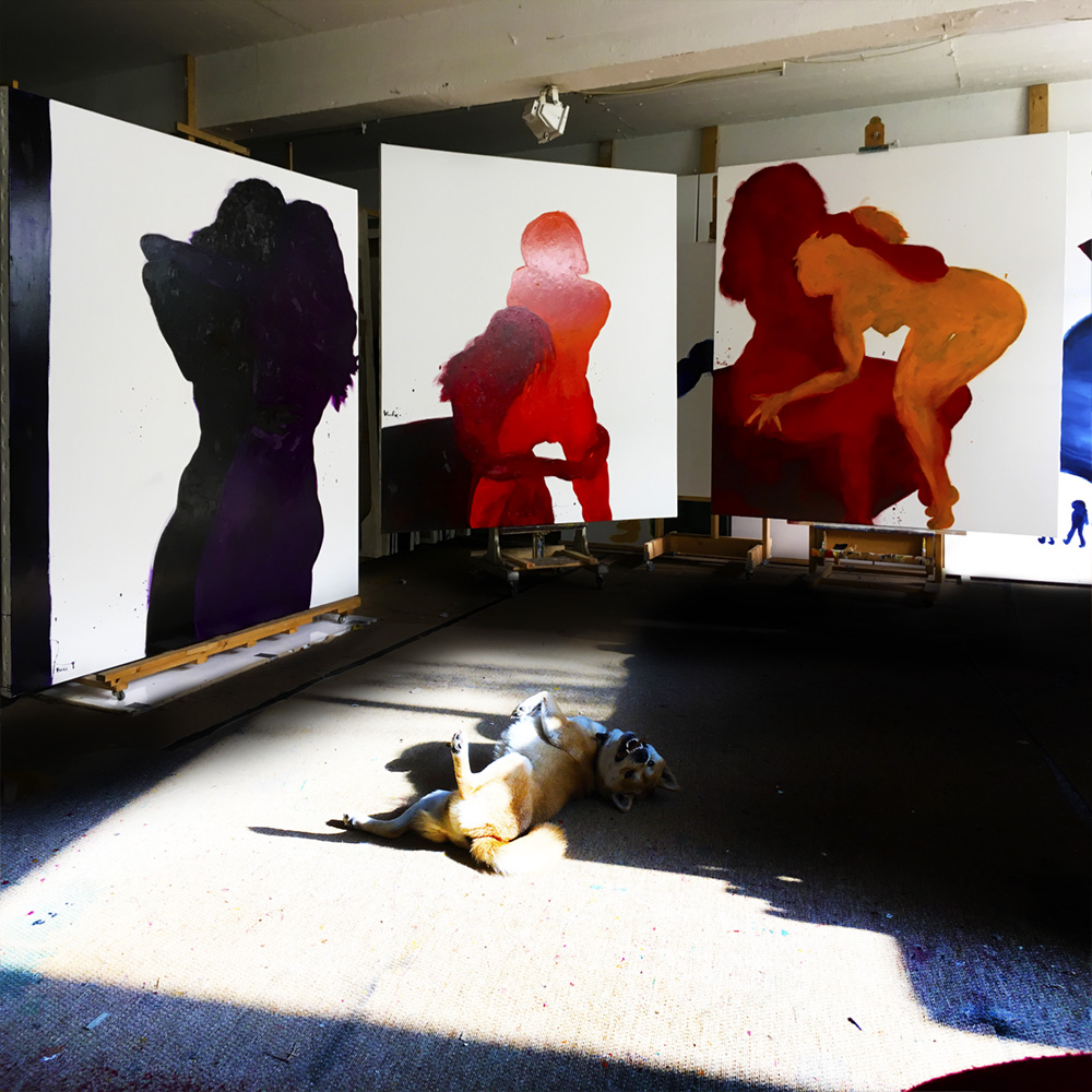
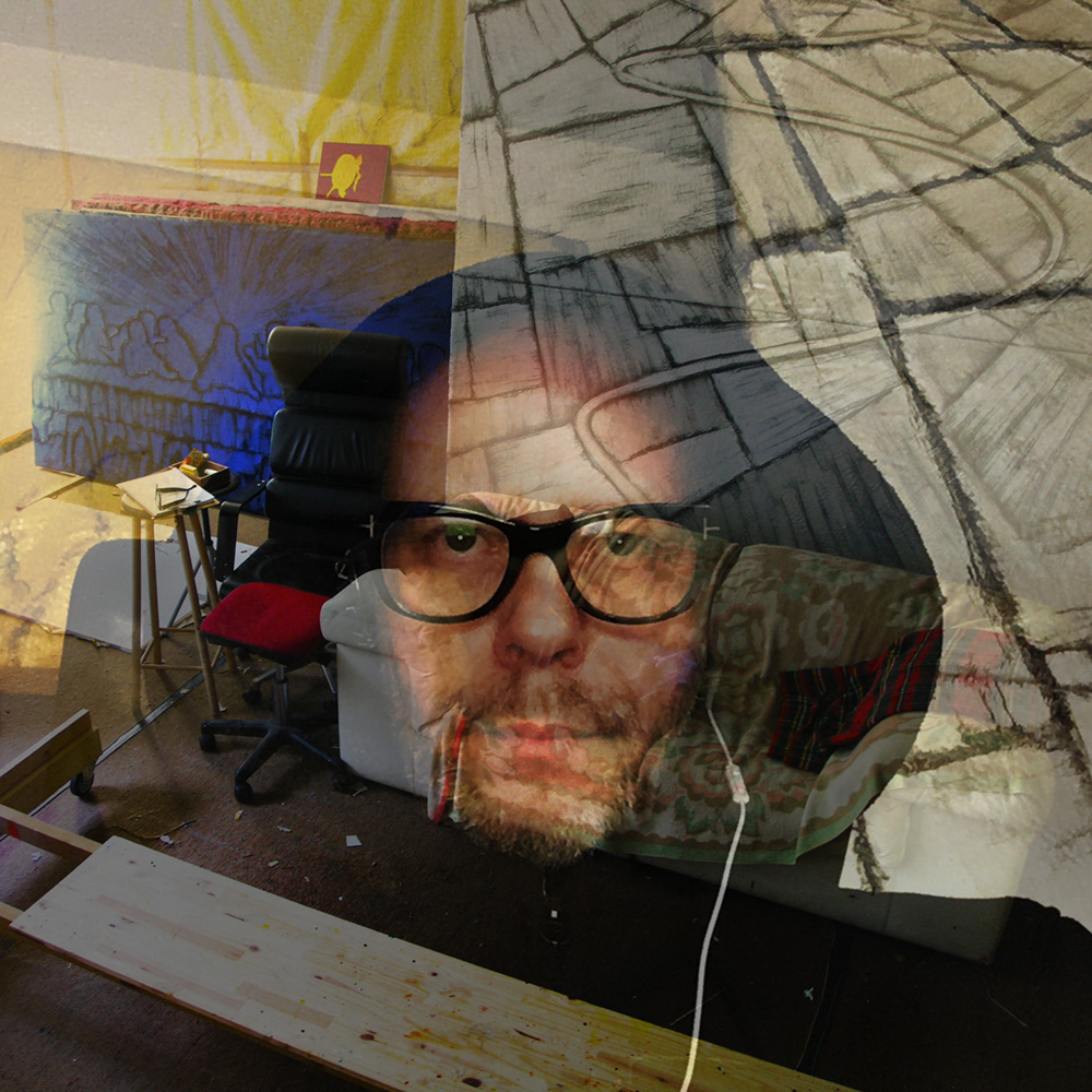
A quick tour around the studio with Gin…
But it was just a kind of silence before the storm, because all my experimenting with oil and enamel paints was coming to a conclusion. Generally speaking all the years before, roughly since 2003, were about materials rather than narratives, although they always influenced each other. I wanted some aspects of oil and enamel and combine these into one usable paint. To make the story short, I introduced the use of a glaze medium.
The reason why this glaze medium worked so well for me was because it combined the oil paint pigment quality with the glazing medium of enamel witch made the pigments so much deeper in color. Which was precisely why Jan Van Eyck developed this technique.
So, armed with that new idea of glazing, I picked up a brush and started painting again. I must admit, it was like an explosion of works and new ideas and forms and stories and...
Nothing more exhilarating than having an insight that suited all I wanted to say as an artist - for the time being at least.
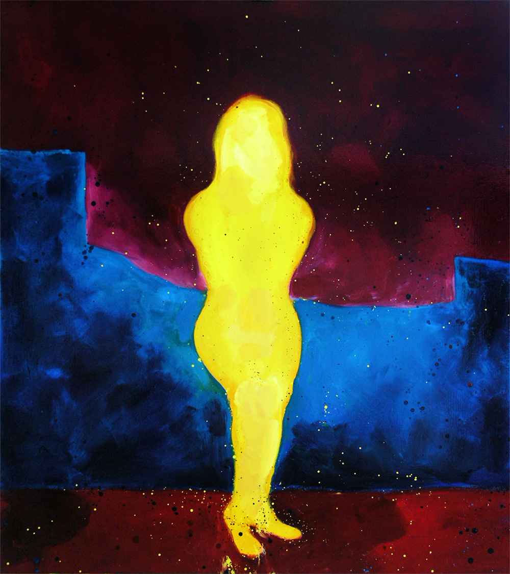
The first painting that hit the mark was "Cornered" (oil & glaze medium on canvas, 120 x 150 cm). And because I didn't wanted to be distracted by looking for a narrative, I based these first series of paintings upon ink drawings I did years before.
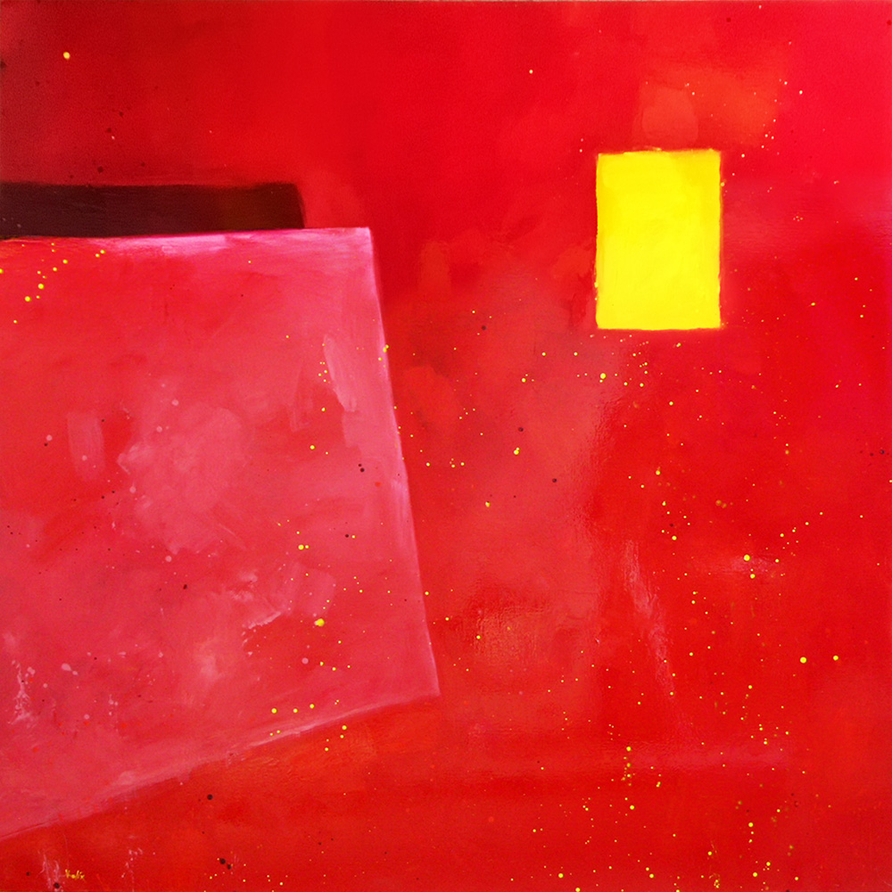
These first glaze series were all painted with no background accept for the white gesso canvas. "Working Girl" (oil & glaze medium on canvas, 120 x 160 cm).
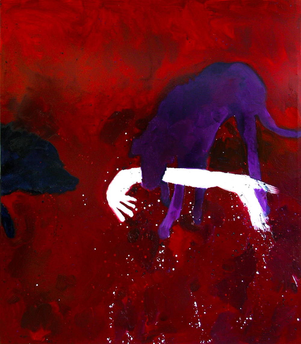
Another thing that happened while making these paintings, first by accident than on purpose, were the dripping's. "Heavy" (oil & glaze medium on canvas, 120 x 150 cm).
All that dripping started to behave as a sort of extra dimension, it seemed to indicate movement and time. So I started to use them on purpose, dripping… painting them away… drip some more… wipe... drips... slash... spatter...
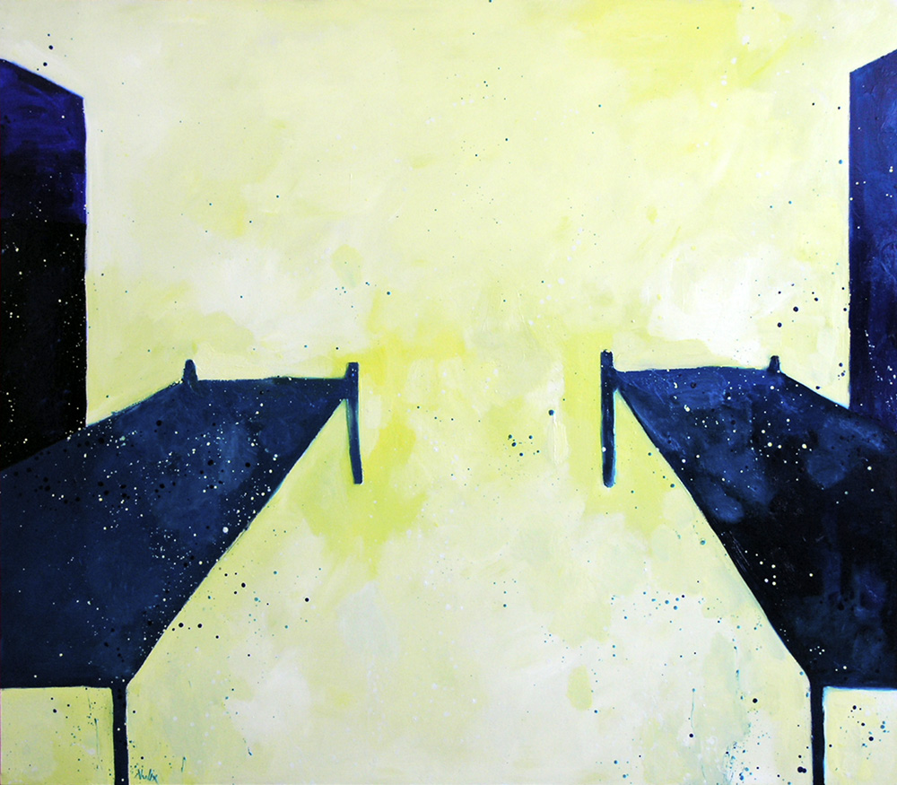
This was the painting where I decided to color the empty background as well, albeit still with white paint. "The Lake" (oil & glaze medium on canvas, 120 x 160 cm).
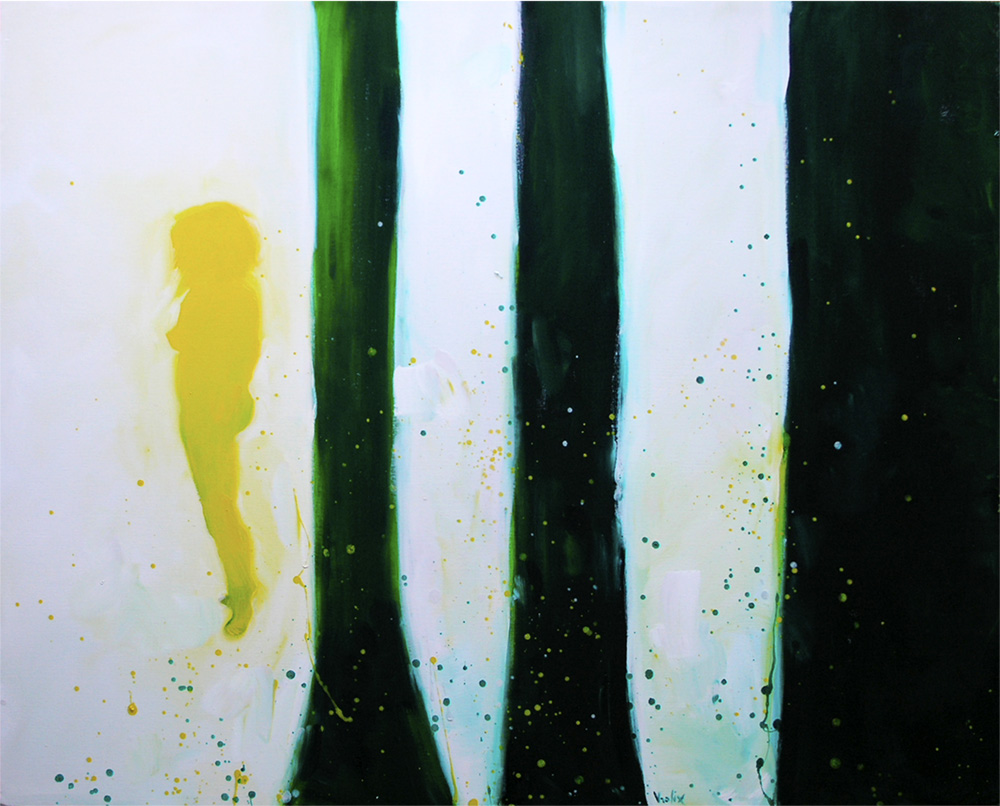
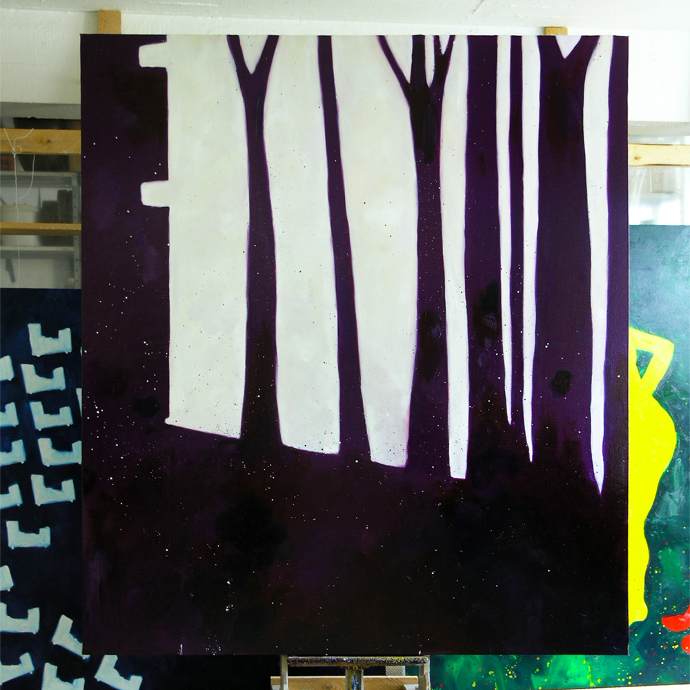
The color shadows inside of the white were because I kept correcting the dripping's. "The Woods" (oil & glaze medium on canvas, 145 x 180 cm).
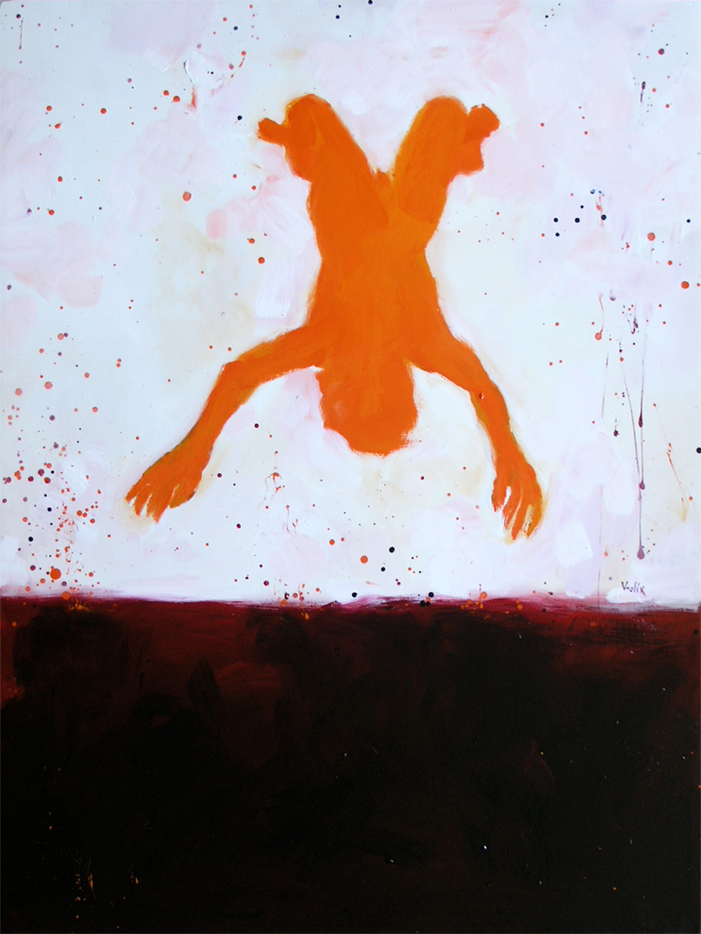
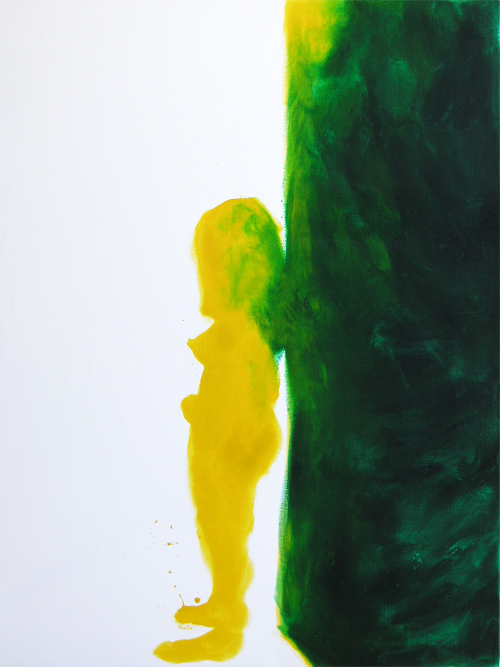
For some reason while doing these paintings I was thinking about classical art and their mythological subjects. It seemed to be fitting with this glaze technique. A Bruegel influence perhaps? "Icarus" (oil & glaze medium on canvas, 135 x 180 cm).
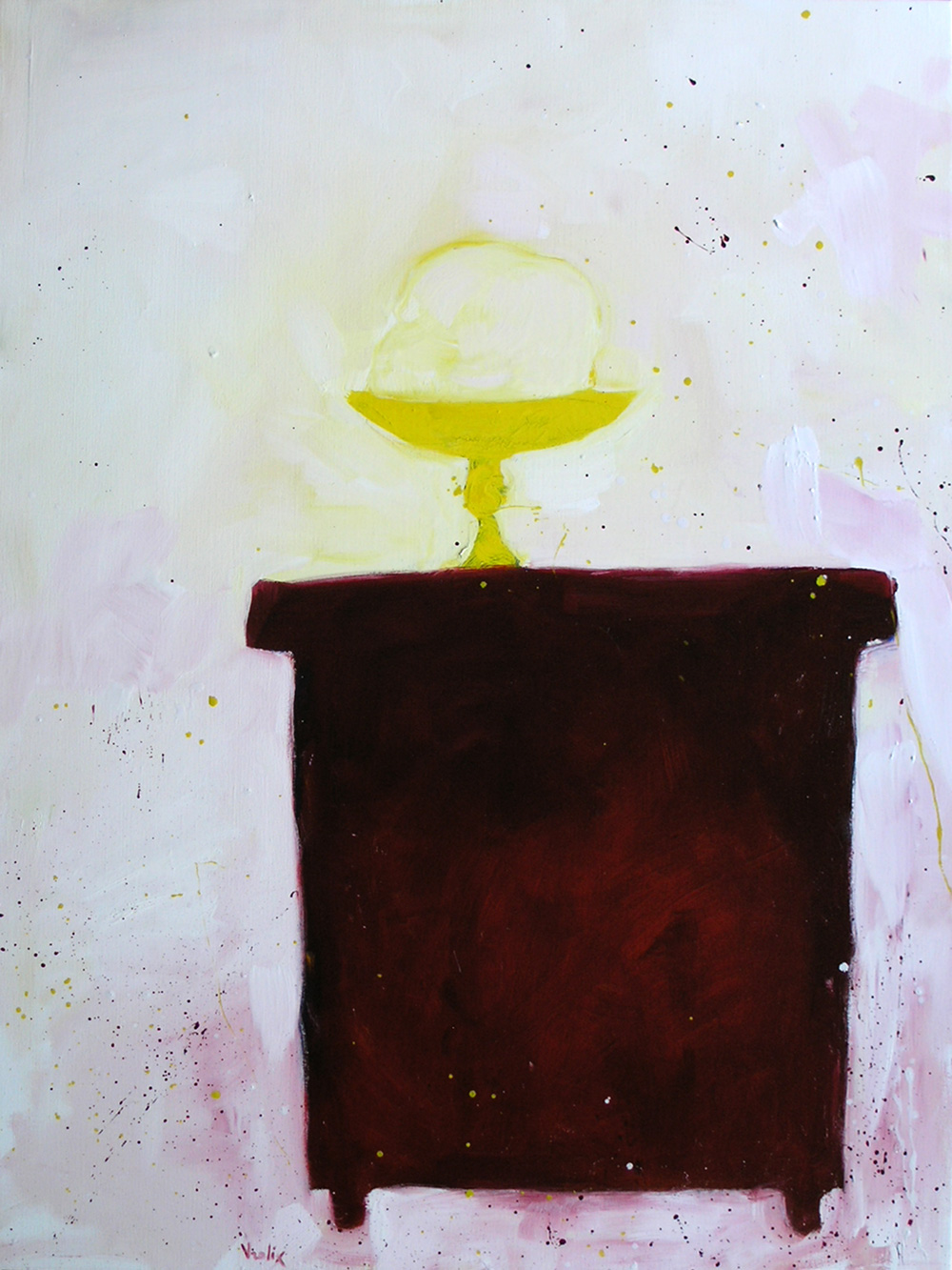
I even painted a still life with a skull in a bowl. "Memento Mori" (oil & glaze medium on canvas, 120 x 160 cm).
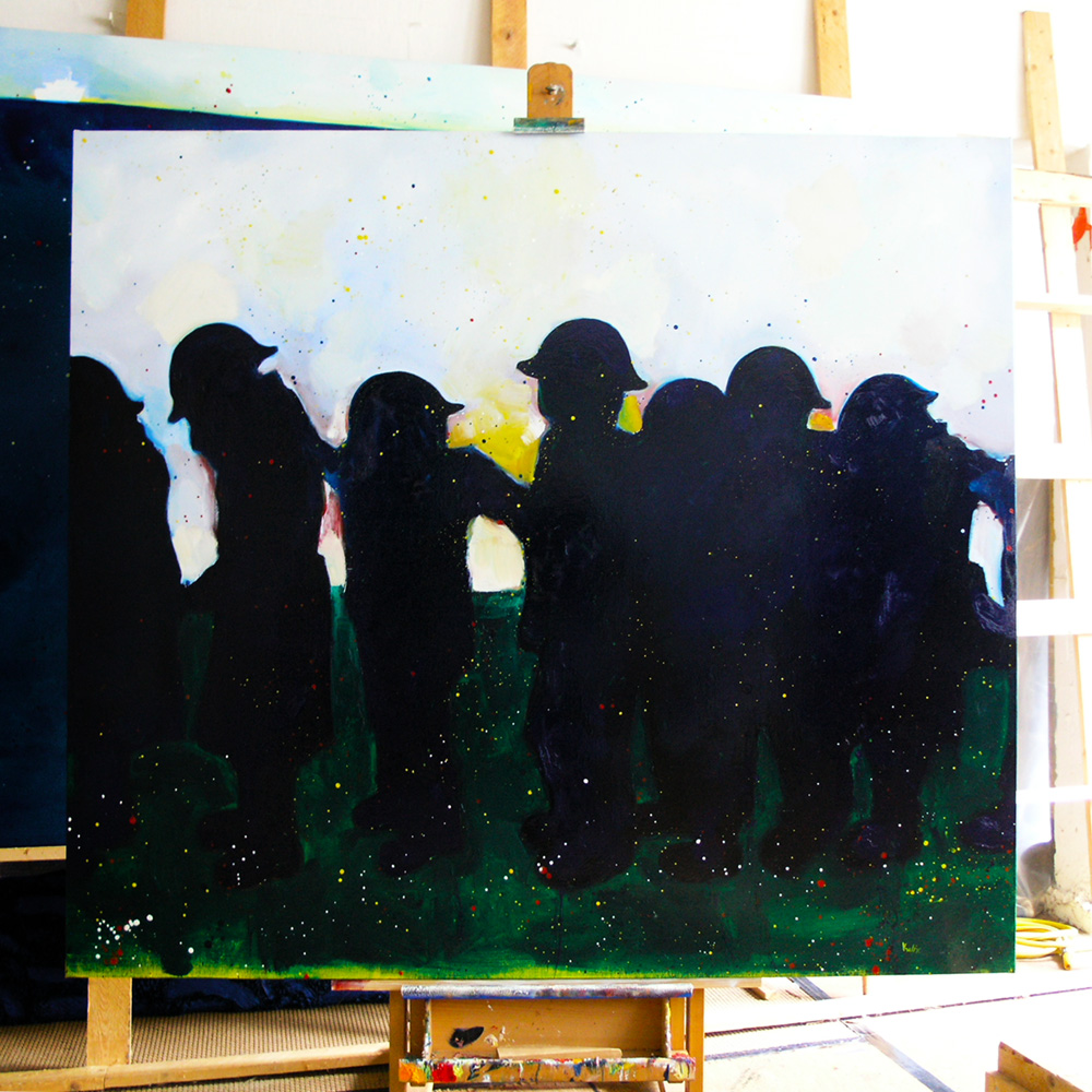
But not all paintings in this series had mythological subjects of course, like this evocation of World War I. "Sunrise" (oil & glaze medium on canvas, 160 x 180 cm).
One of the paintings that marked the end of the second glaze series (or the beginning of the third) was "Winter Garden" (oil & glaze medium on canvas, 200 x 230 cm). Here I experimented with the question, what was actually perspective, the white background of the trees or the form of the villa...?
In the third glaze series I dropped the white background all together. Now I worked with color groups. "Curiosity Killed The Girl" (oil & glaze medium on canvas, 175 x 200 cm).
There was also a tendency towards landscapes and interiors rather than just human figures. "Retreat" (oil & glaze medium on canvas, 175 x 200 cm).
As matter of fact, as an artist and painter I always considered a landscape or interior very much as something individual, something that had its own character and identity. Or to quote the Dalai Lama: "Rocks have feelings too." "Haunted House" (oil & glaze medium on canvas, 190 x 190 cm).
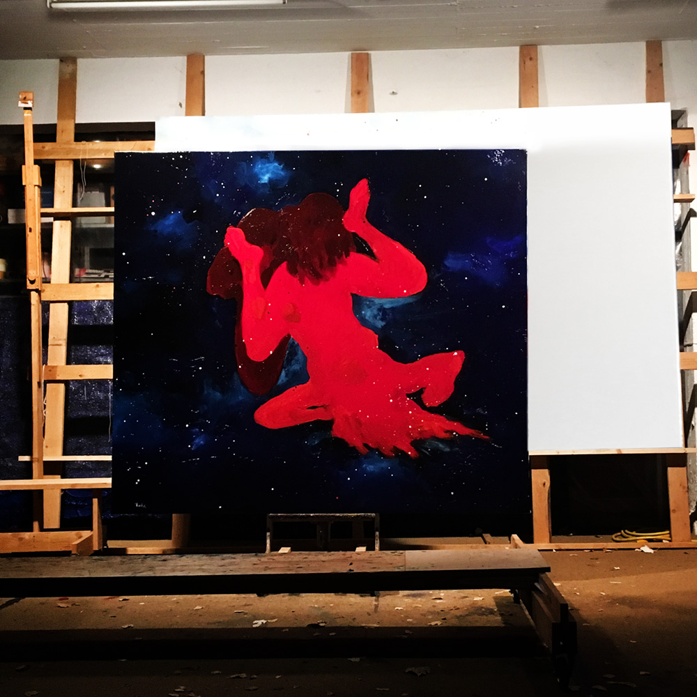
Something that wasn't visible in these images, was the workings of the glaze itself. The more layers of oil/glaze I painted, the stronger these glaze colors became. Thus creating a kind of patchwork of color reflections, depending on where the onlooker stood and from which direction the light was coming. But it was certainly like a color explosion in my studio!
The interiors, in a way the fourth series of glaze paintings, were very conscious like. They had a life of their own. The "Red Studio" (oil & glaze medium on canvas, 180 x 180 cm) wasn't really my studio, of course, just an evocation of it, inspired by the painting with the same name by Henri Matisse.
I even picked up an older theme from 2009, the "Spanish Flu" series. "Brothers" (oil & glaze medium on canvas, 175 x 200 cm).
Although beds were never far away as a subject in my paintings. "The Protection Racket" (oil & glaze medium on canvas, 160 x 180 cm).
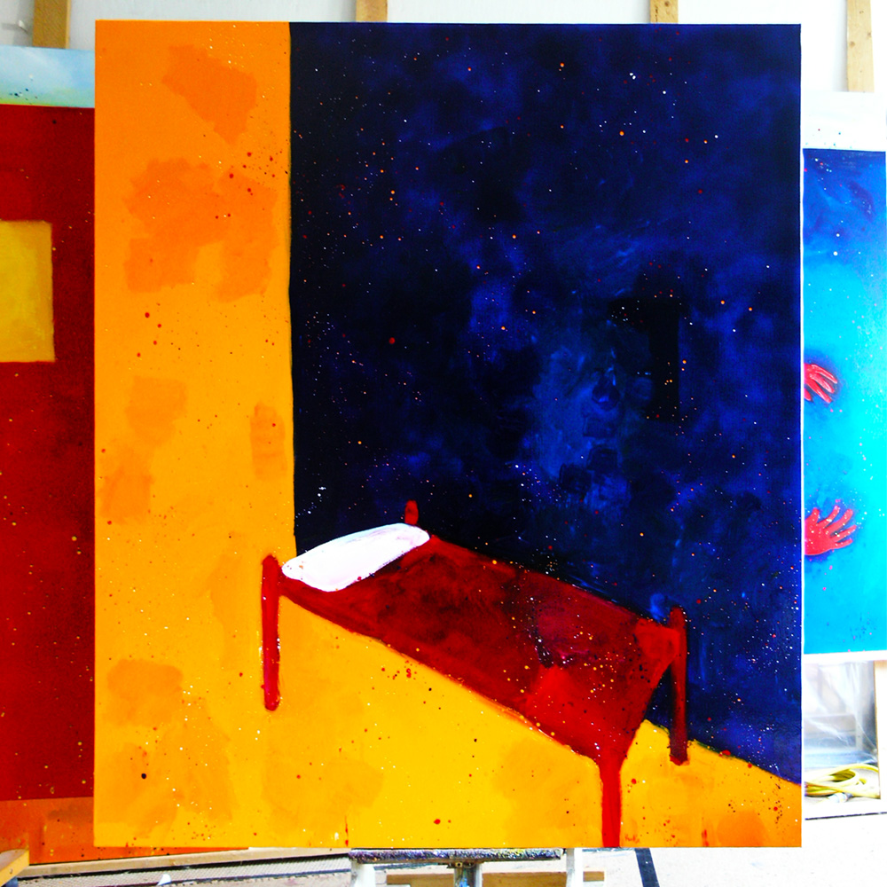
This painting, "Sleepless" (oil & glaze medium on canvas, 175 x 200 cm), became one of my favorites.
After that new series of beds it was just a small step to the painting "Puberty". It wasn't that I started to look at the old masters, I never stopped looking at them, or that I wanted to create some sort of interpretation of their works, it was just that their sheer quality was so damn inspiring. "Puberty (after Munch)" (oil & glaze medium on canvas, 160 x 180 cm)
Definitely one of my personal favorites. That's what you got when looking too much at Goya's work. "Dogs Of War" (oil & glaze medium on canvas, 175 x 200 cm).
I tended to stay away of political subjects, most of the time. People traveling to the Mediterranean, by car or plain, seeking sunshine. vs People fleeing over the Mediterranean in hardly floating boats, many drowning. "The Mediterranean" (oil & glaze medium on canvas, 200 x 300 cm).
Detail from: "The Mediterranean" (oil & glaze medium on canvas, 200 x 300 cm), just in case you missed the fancy yacht on the horizon...
This painting was inspired by the Shunga woodblock prints by Hokusai. The term Ukiyo-e translates as "Pictures of the Floating World", witch was the entertainment (red light) district of seventeenth century Edo (Tokyo). "Ukiyo-e" (oil & glaze medium on canvas, 175 x 200 cm).
This last series was a more exotic one, I guess, or at least more erotic. "Jungle Fever" (oil & glaze medium on canvas, 175 x 200 cm).
Every so often I had to deal with my doubts about, well, about everything, I guess, but mostly about my work and how to proceed as an artist. You learn to life with it, work with it even...
"Odalisque" (oil & glaze medium on canvas, 175 x 190 cm). Plenty of those in art history.
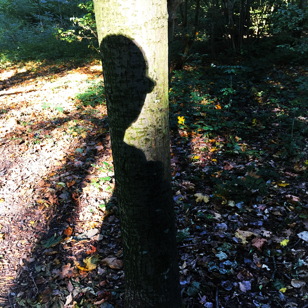
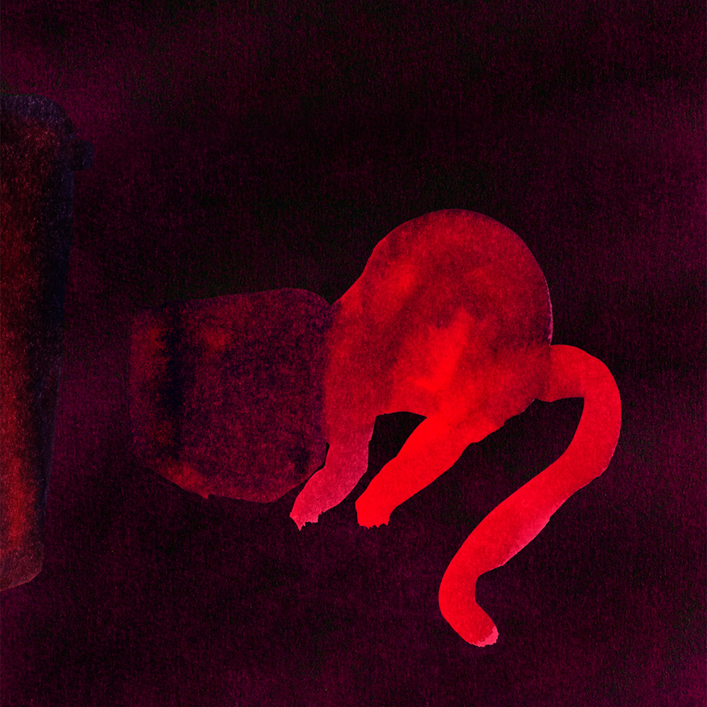
In the meantime my "Walking with Gin" photography continued. I know I would be get tired of doing so, but not just yet. Amazing what you can get out of looking each day with a fresh eye while walking the same path over and over again. "Monster" (From the series “Walking with Gin”).
"Designed by Nature" (From the series “Walking with Gin”).
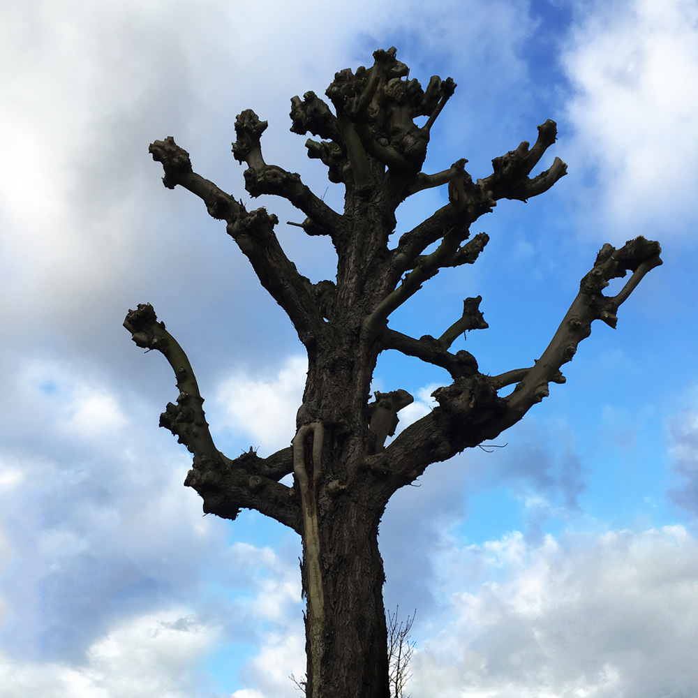
"Self Portrait as a Tree" (From the series “Walking with Gin”).
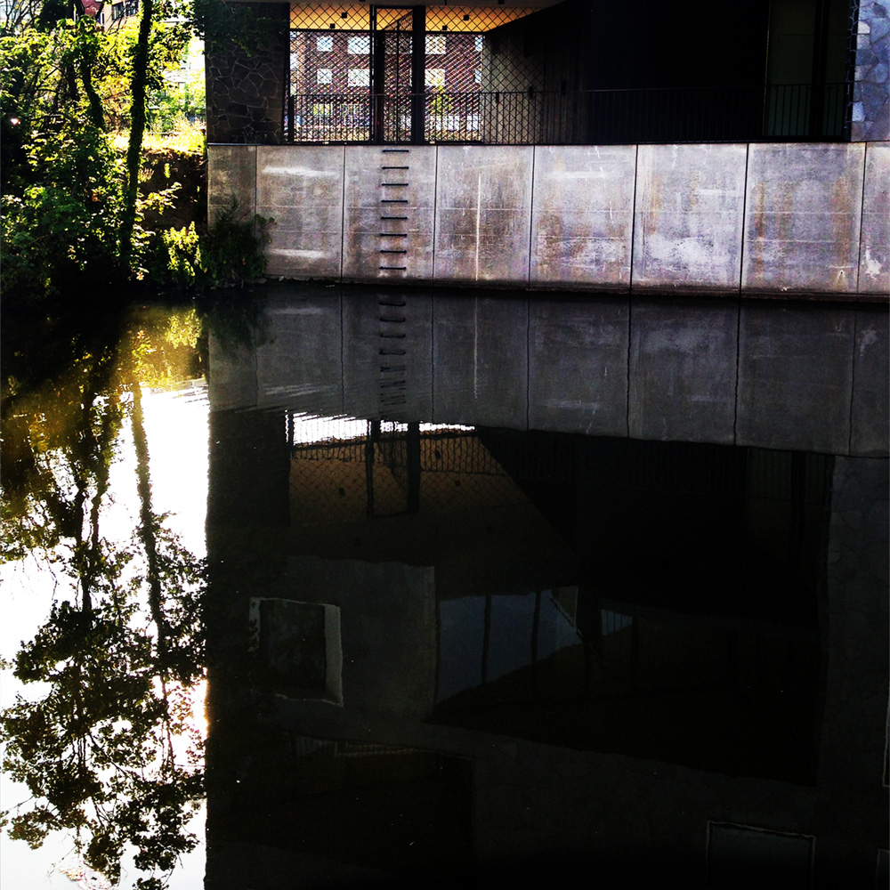
"Escape Route" (From the series “Walking with Gin”).
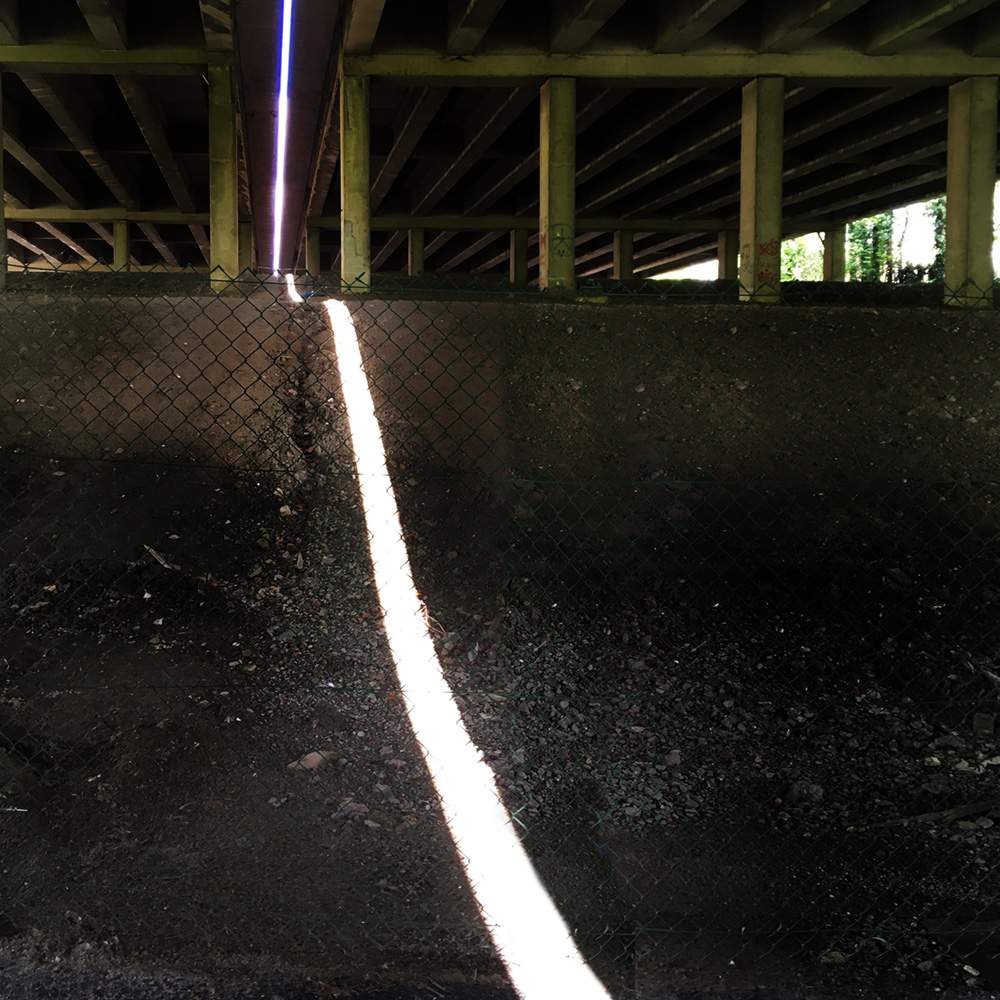
"Light Rope" (From the series “Walking with Gin”).
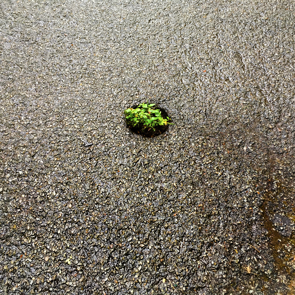
"Pothole" (From the series “Walking with Gin”).
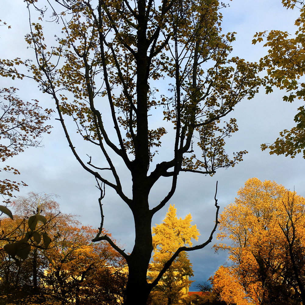
"Autumn" (From the series “Walking with Gin”).
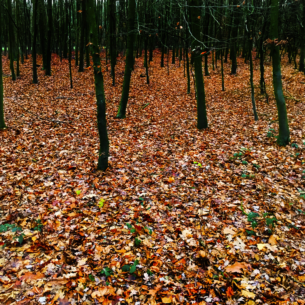
"Autumn" (From the series “Walking with Gin”).
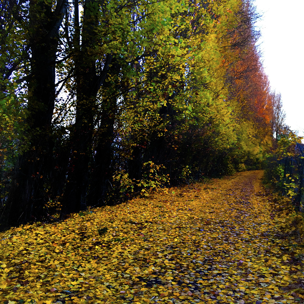
"Autumn" (From the series “Walking with Gin”).
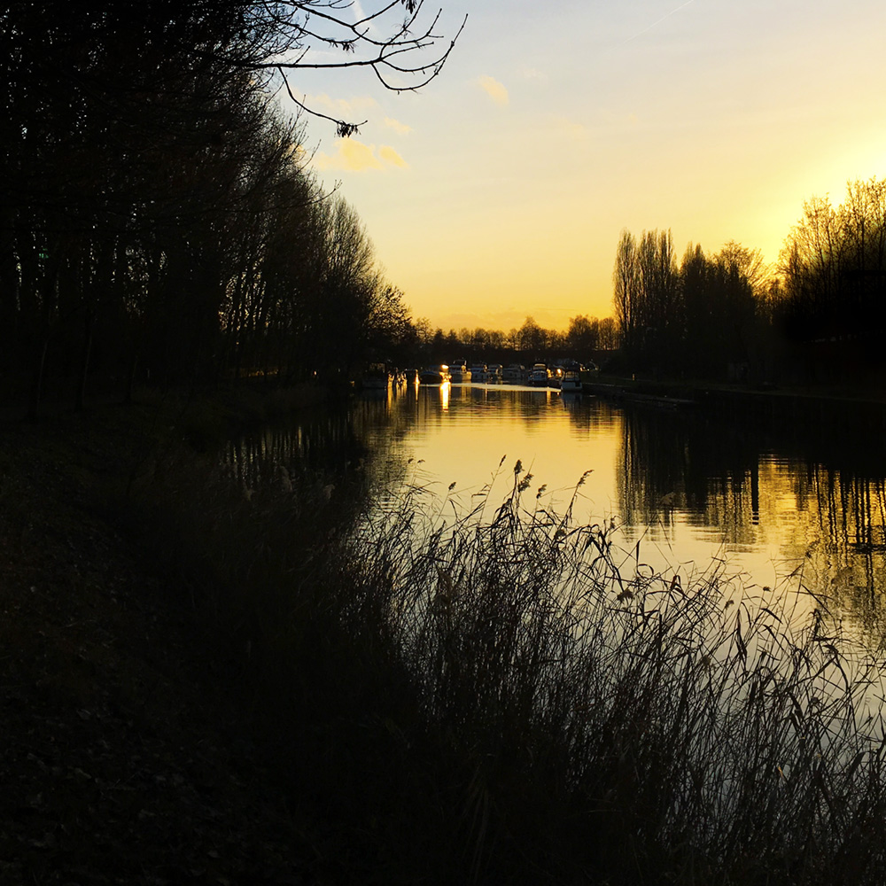
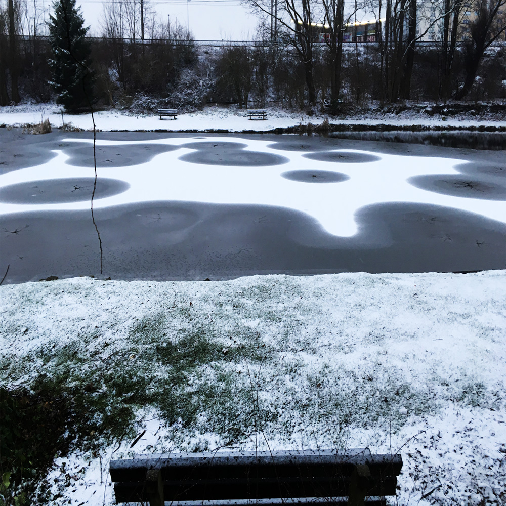
"Sunset" (From the series “Walking with Gin”).
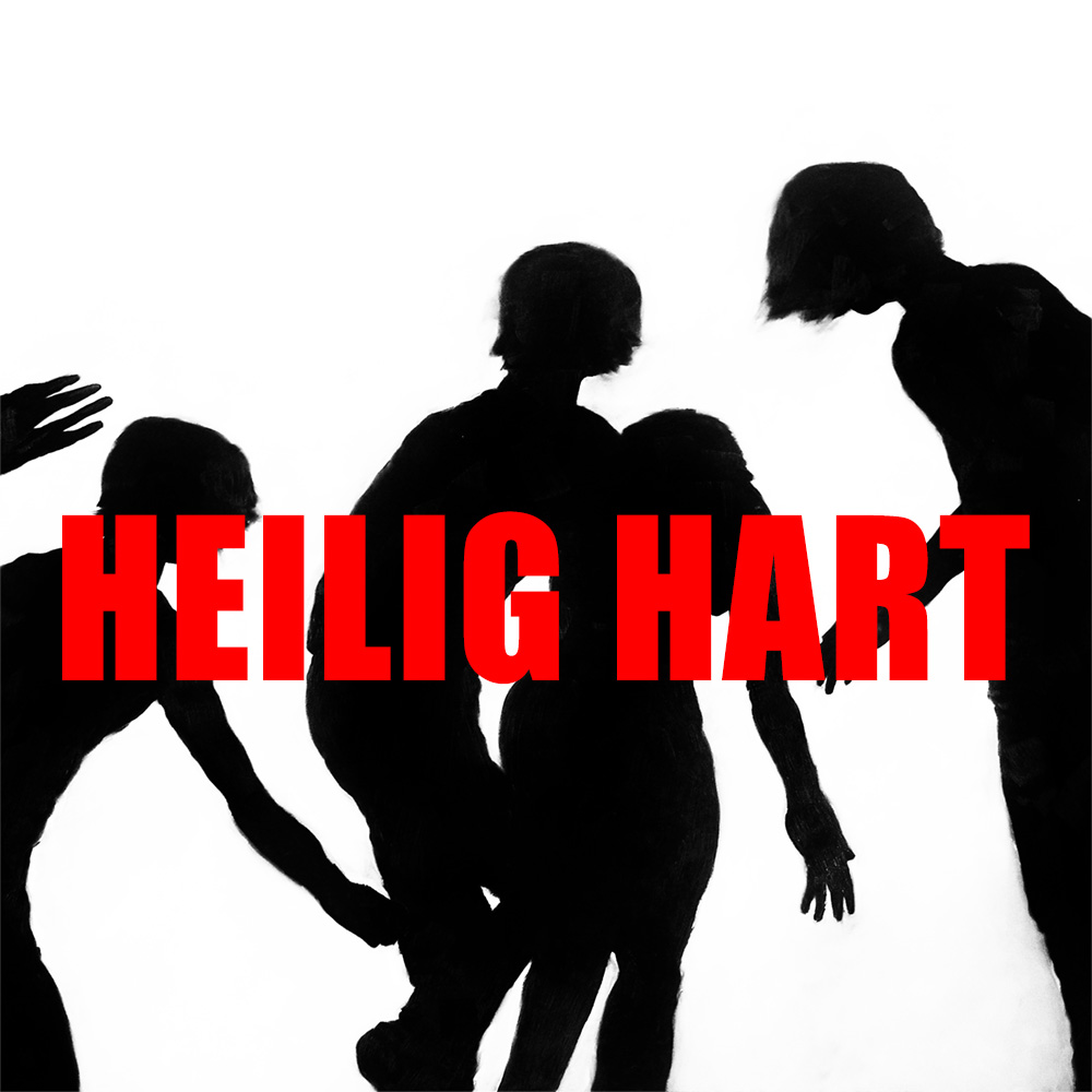
I designed sets for three plays that year. The first one was "Heilig Hart". For the poster design I used one of my paintings ("Tokyo Park", oil on canvas, 175 x 200 cm), from a series that was based on a book titled "The Park" by the Japanese photographer Kohei Yoshiyuki. It seemed fitting the play in more than one way.
Set design for "Heilig Hart". It was the imagining of a park (at night) in the middle of a city. As always the playwright/director wanted multiple scenes, witch was easy enough in a movie but almost impossible in theatre, not with their miniature budget at least. So I designed a set that would show an infinite amount of viewpoints, just by using a special designed platform that could rotated 360°.
Set design for "Heilig Hart". The "trees", pillars, like the platform itself covered with black carpet, were organized in a checkerboard pattern. And because the platform was always turning, first slow, then faster and faster, the actors had to move (or dance) all the time. The music was composed and performed life by Jean Yves Evrard.
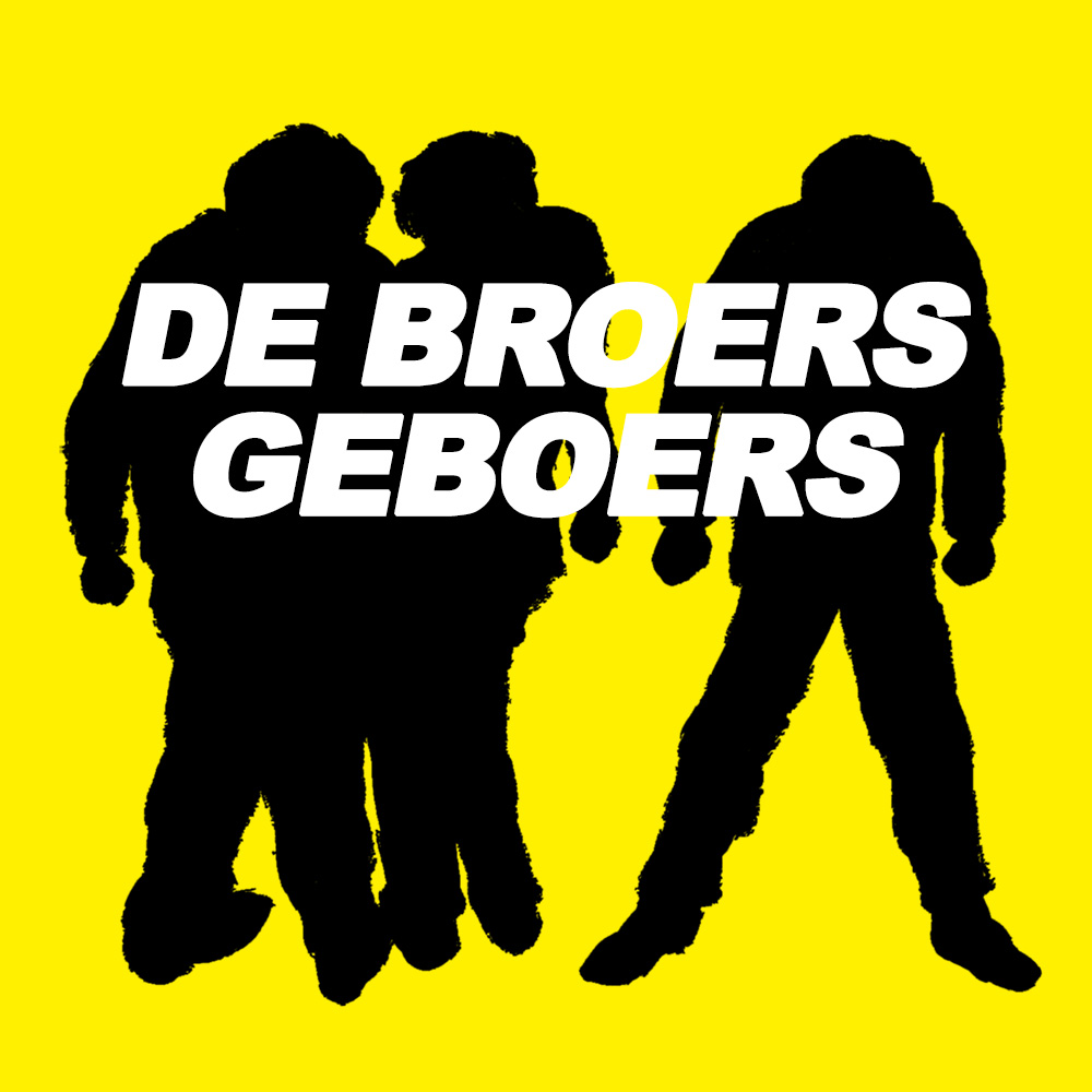
The second set design I did was for the play "De Broers Geboers", which was actually a remake, and the first set I ever designed, from 1988. I even used the original ink drawing to redesign the poster.
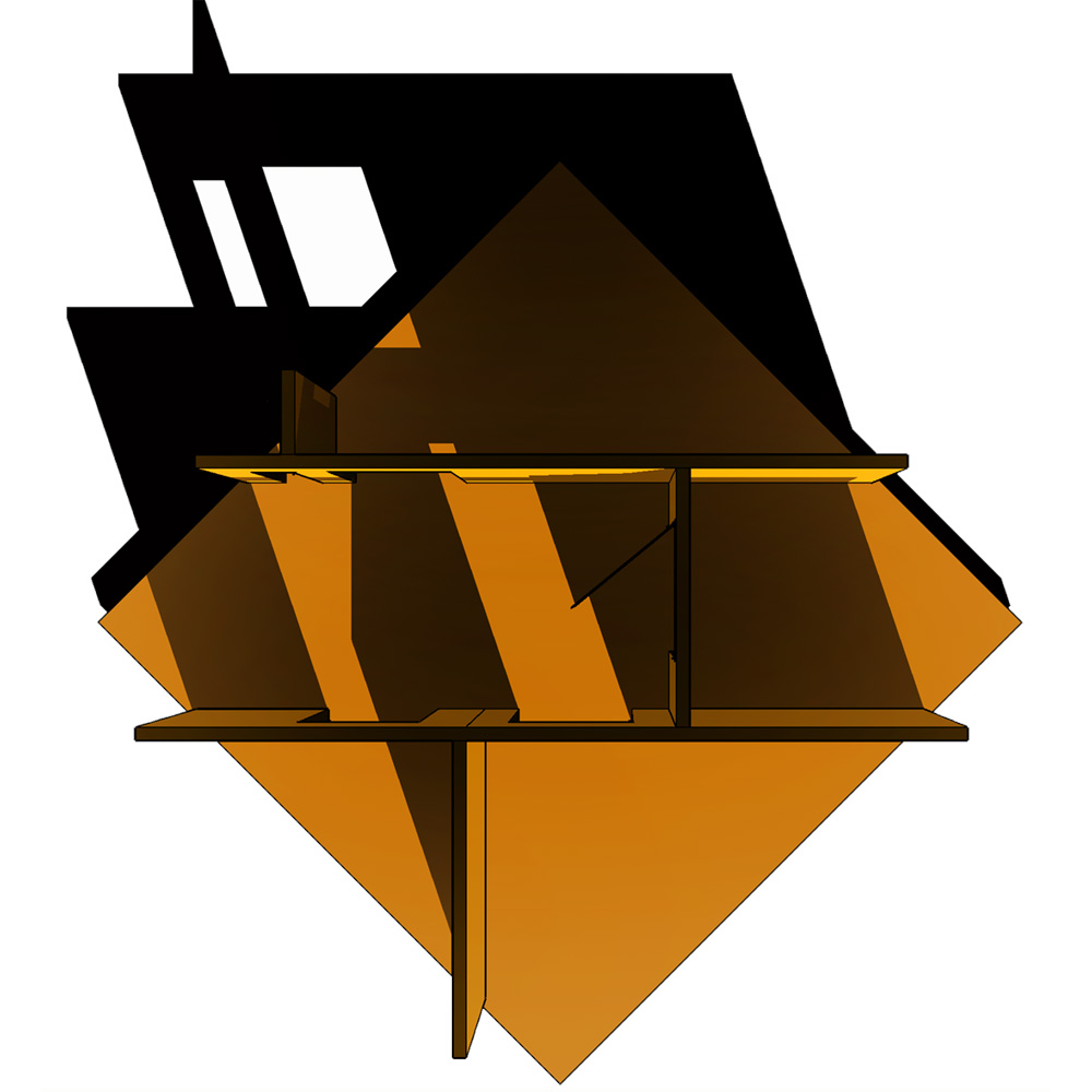
Set design for "De Broers Geboers" Because the playwright/director loved the turning platform from "Heilig Hart" so much, I redesigned it into a square, and showing an interior on top of it without the outside walls, like as if you would cut a piece out of a building.
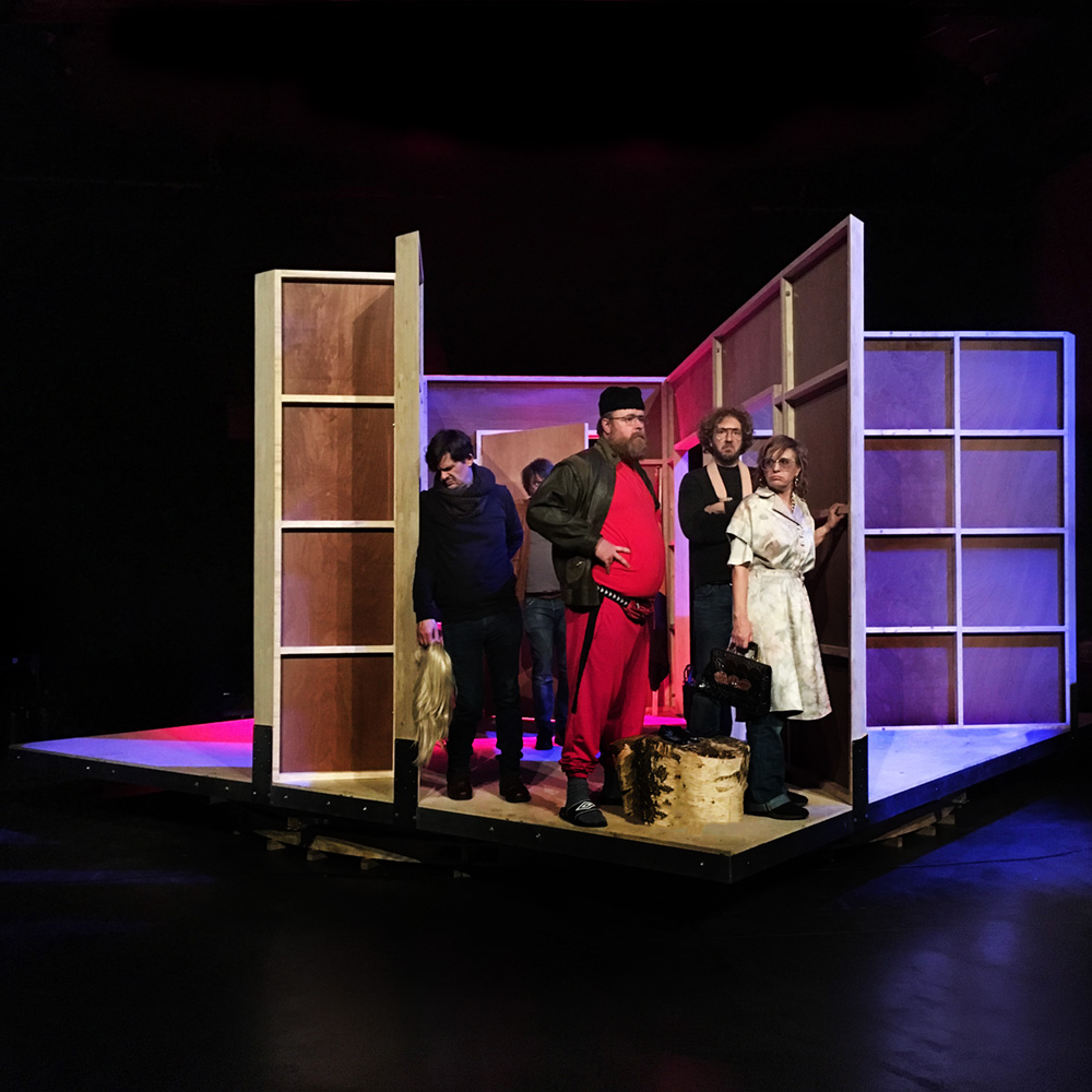
"De Broers Geboers" during rehearsals.
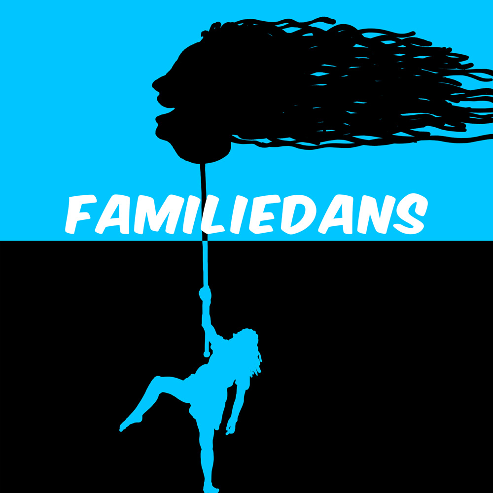
The final set design that year was for "Familiedans”. This one didn't get much further than the poster design and some preliminary sketches.
Basically, the set design for "Familiedans" was very much like a shadow puppet play, you know, like the ones from Indonesia...
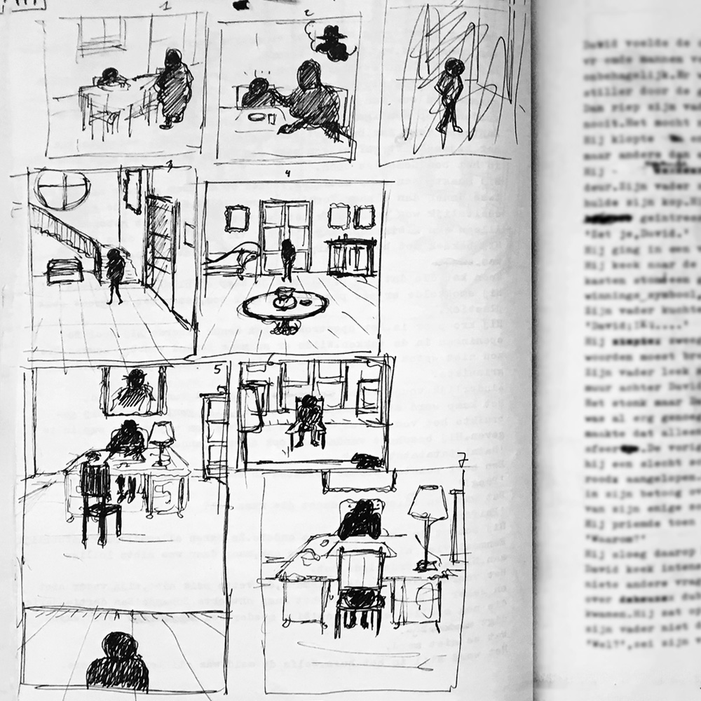
Creating a (new) graphic novel was a bit like working as a medieval monk. Starting at dawn, standing at my workstation, working my way through each image, in total silence, for a couple of hours, usually until noon. Like (time) traveling through my imagination. I loved it.
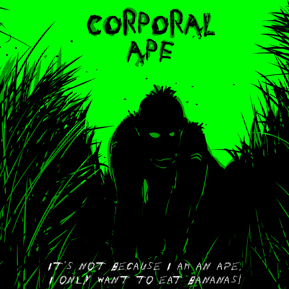
That year I created a couple of graphic novels. Although, "Corporal Ape" (70 pag, 7"x10”, color) was probably more something between an illustrated novel and a children's book, but not quite. To be honest, I didn't know how to categorise "Corporal Ape", just that I had a lot of fun creating it. Story: "It's not because I am an ape, I only want to eat bananas! When I joined the hairless apes in their war against an invasion, I didn't know what to expect.Though they feared me at first, I would soon prove my worth on the battlefield and learn what it means to be a gorilla in a man's world."
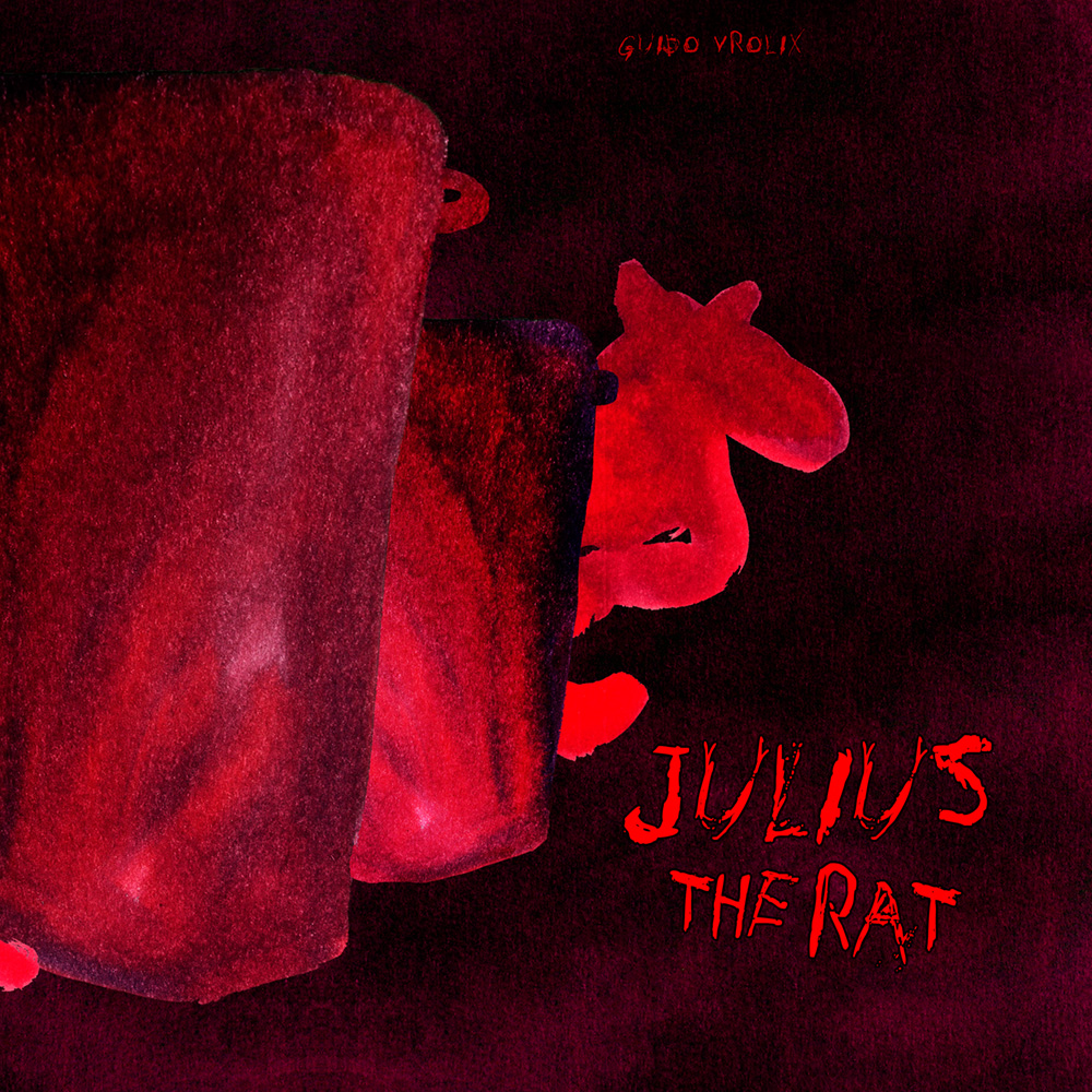
Another graphic novel that was probably more of an illustrated novel (for kids?), was "Julius The Rat" (50 pages, 7"x10”, color).
No text in this one though, just one page drawings about the (mis)adventures of Julius (The Rat). You had to use your imagination to come up with a story.
GRAPHIC NOVELS & Co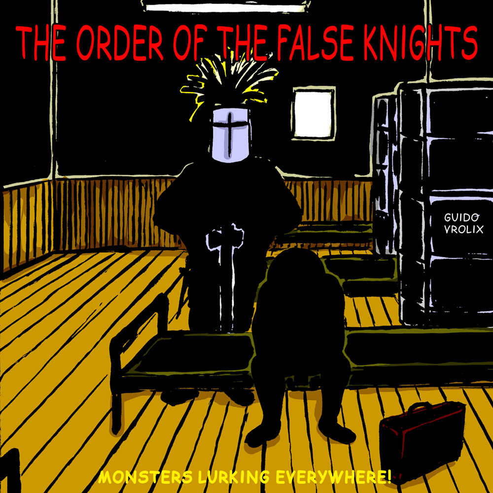
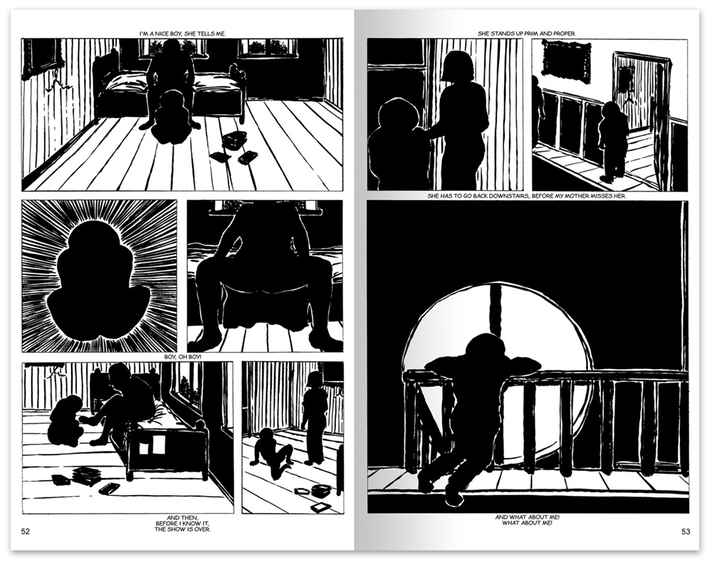
The graphic novel "The Order Of The False Knights" (100 pages, 7"x 10”, b/w) was probably the one I worked on the longest over the years. The story of a boy growing up, although not so much an account of what really happened then how he wishes to remember it.
It started as an experiment in 1989, a more-novel-then-graphic kind of thing. I even made a color version of it somewhere around 2004 before finally settling for the original black and white version. I did rewrote the text, though, but without any text-balloons typical for a graphic novel.
"The Order Of The False Knights - Monsters Lurking Everywhere!" The story: "After this summer vacation, I'm off to boarding school for the first time, but until then I have the House to myself. That is, along with Mom and Dad, of course. The House sits at the edge of the Forest, which is a great place for all my Adventures and is full of Knights who are not to be trusted. And when it gets dark, a Horror that steals Dreams appears from under the Trees..."
This was how I usually ended the day, lounging in my studio, in my vintage 1980s Kukkapuro design chair, contemplating my work.